Clearwater Growth
A new finance brand targeted at entrepreneurial businesses seeking their first PE investment.
A new finance brand targeted at entrepreneurial businesses seeking their first PE investment.
Clearwater International wanted to launch a new division designed to unlock £250m of new domestic and international investment for entrepreneurially led high-growth businesses – Clearwater Growth.
The key challenge with this particular project was that the target audience were not familiar with Clearwater International, and in fact, global financial advisories such as this were deemed intimidating to our target audience, who are mainly seeking private equity (PE) investment for the first time or looking to plan their exit strategy, but had very little understanding of what PE actually meant, or of the options available to them.

Clearwater International were keen to ensure the wealth of experience, knowledge and reach of the team were leveraged as part of the new brand and initially, the client was keen to build a sub brand that sat alongside the parent brand identity.
However, once we had researched the market and the target audience, developing outline personas, it was clear to see that in order to reach this audience effectively, we needed to move away from the corporate tone of the parent brand.
Clearwater believes entrepreneurs are heros and SMEs are the backbone of the economy. They were, and still are, an independent and entrepreneurial business. They have walked in our audiences shoes, and understood how hard business owners have fought to get to where they are today, and that they speak directly to the entrepreneur.
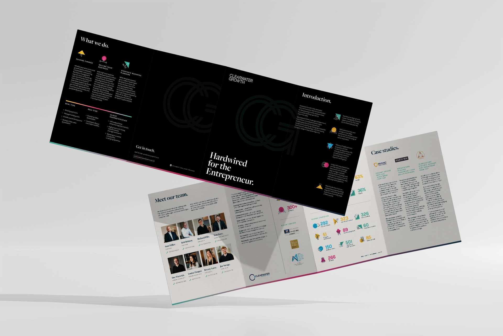
This resulted in a final positioning statement ‘hardwired for the entrepreneur’ which guided the creative and helped stakeholders feel comfortable with the decision to move away from the current branding. We ensured that the credibility of Clearwater International was leveraged across all touchpoints at the appropriate point in the journey.
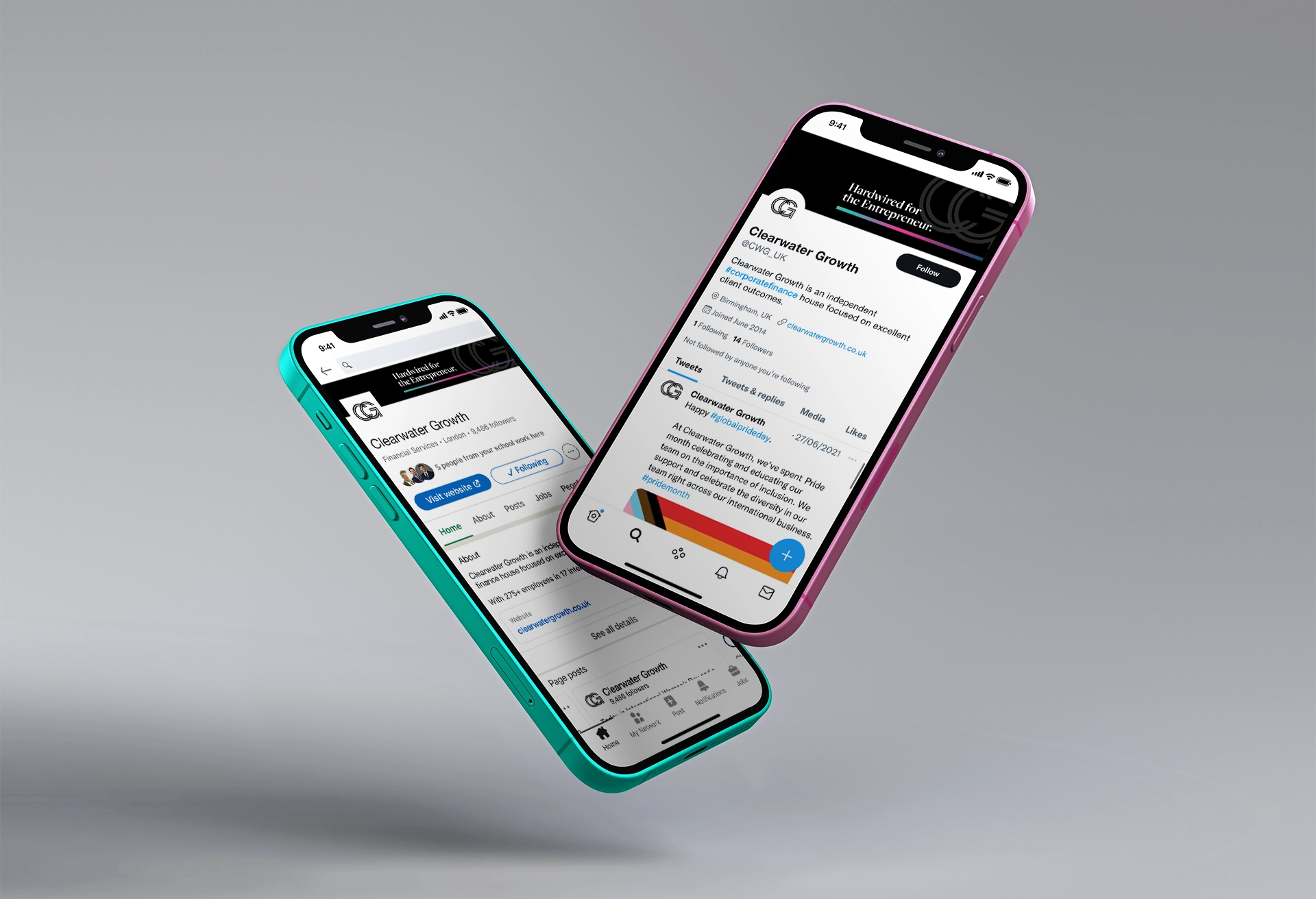
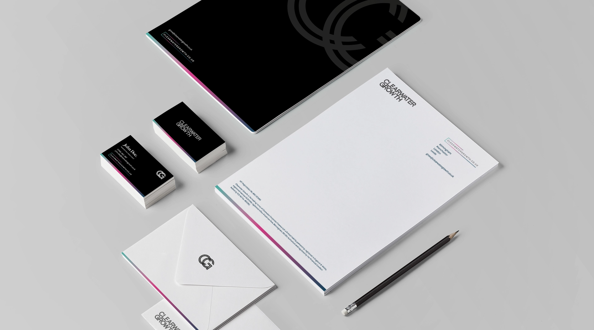
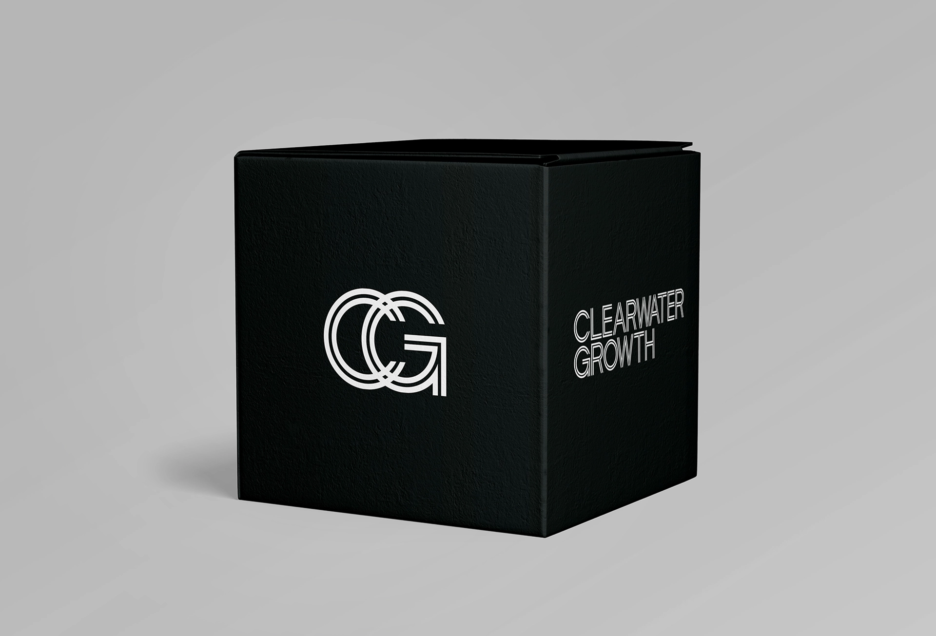
A custom design logotype was fashioned with an inline feature – white lines appearing inside the character letterforms. This formed the ‘hardwire’ that courses through Clearwater Growth’s team creating a confident and striking design.
This enabled the wider brand identity to be professional but with a younger feel. A strong use of black and white, supplemented by minimal use of bright colours, lifted the identity away from the expected norm in this sector, and created its own space.

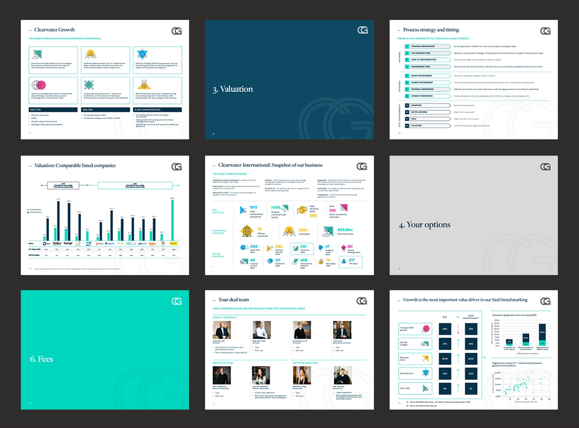
The business launched in early May to a lot of interest – helped with a website launch, graphic design, and an introduction animation.
One comment by a direct competitor was “Great website! Love the messaging.”
Since the launch, we have supported CG with additional projects.
___
Update May 2024 – Clearwater Growth has been merged into a rebrand for Clearwater so the website is no longer live.