Orca
Repositioning, rebranding and renaming tech services company Orca
Repositioning, rebranding and renaming tech services company Orca
HW Technology approached Think to complete a rebrand as they moved away from the Haines Watts Group and needed to adopt a different look and feel better suited to a growing IT provider, rather than accountants. This would, of course, include a new name.
HWT had completed a business strategy deep dive previously and outlined their understanding of how they would like to be positioned in the market. However they were looking for a brand audit/health check to ensure that everyone was still in agreement and, with the help of a strategic design partner, lead to a slight refresh of the current brand strategy.
Whilst there had been a lot of thought applied to who the ‘new HWT’ would be, the first draft positioning lacked a uniqueness that would help us set them apart creatively. We proposed a workshop to get under the hood of their core offer and credible claims, who they wish to target and why they really thought they were different to every other IT provider in the market – a tricky task.
The outcome was a core proposition built on genuine partnership and a brand essence of ‘commitment you can count on’. The client was keen to really connect with heads of IT and business owners who are kept up at night worrying about potential data breaches. This audience was looking for an IT provider that cares as much as they do, but without all the unnecessary jargon…. the challenge was how do we communicate this dedication without being either too fluffy or overly ‘IT cliche’?
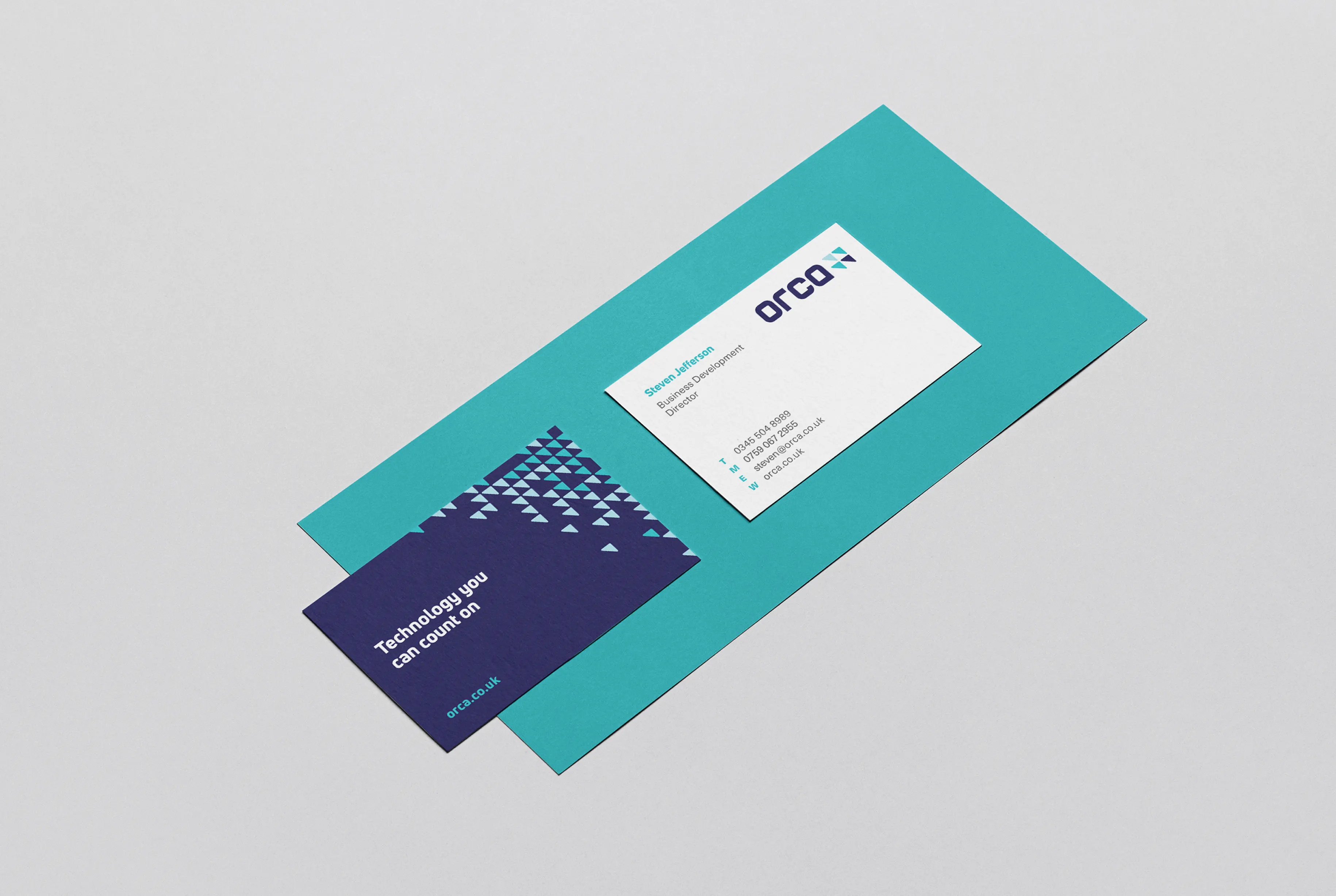
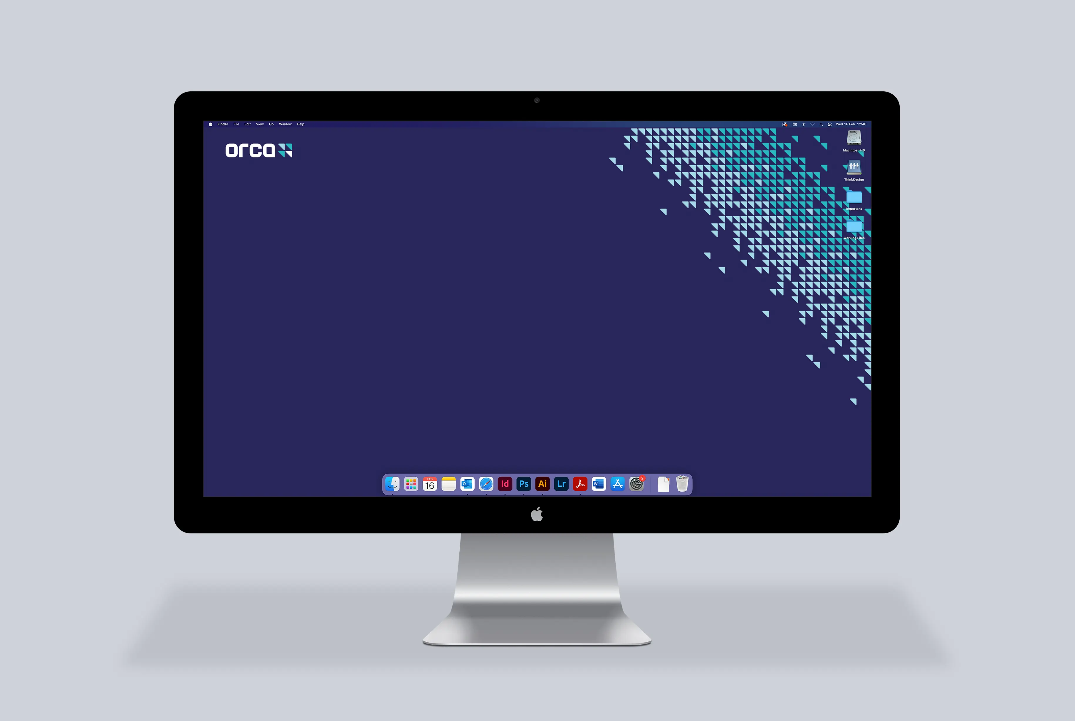
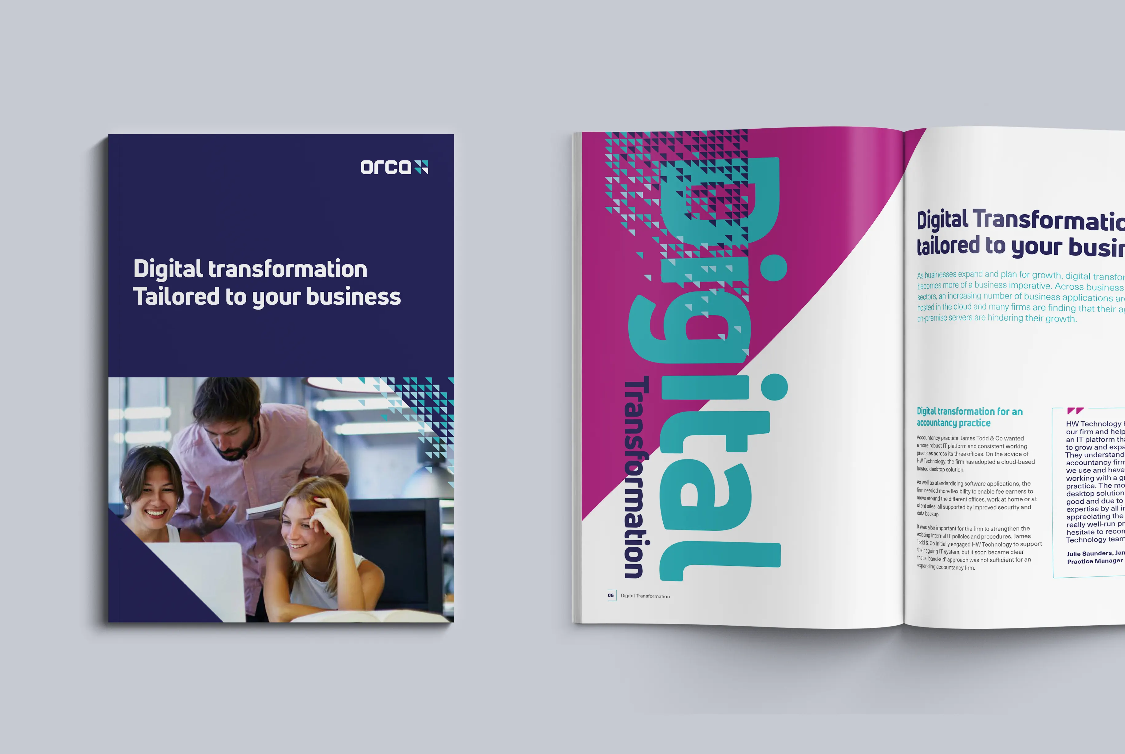
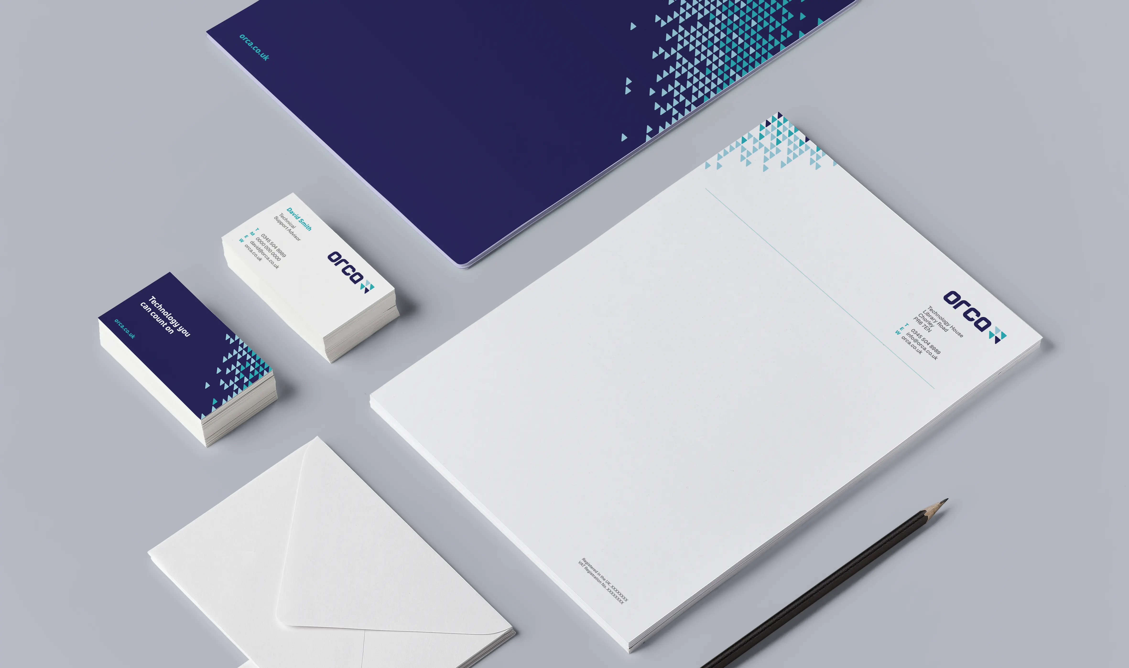
From the outset of the naming process, the design team were swung by both animal and sporting references that spoke to the dedication and ‘team player’ attributes of the brand. Eventually, following the necessary research and availability checks, we settled on Orca. The name symbolised commitment, dedication, problem solving and working together. The strap ‘by your side’ underpinned the core proposition and the graphical execution represented a typical Orca pod, working in unison to achieve the same goal.
The brand was launched across all platforms late last year as the company broke away from parent brand Haines Watts. The response from existing clients has been really positive ‘A great step forward, it looks and sounds great. Well set for a bright future!?’