Creating brand consistency across the various marketing departments for the Outbound Trust with a unified design strategy and supporting visual elements that ensured all creative, from the website to brochureware, felt connected and considered.
Problem
The Outward Bound Trust had traditionally produced marketing communication via various departments without a defined design strategy. Upon the appointment of a new Head of Marketing, the following main issues were identified:
- Inconsistent brand identity style used across digital, sales, schools packs, and fundraising marketing comms.
- Website already underway with another agency.
Approach
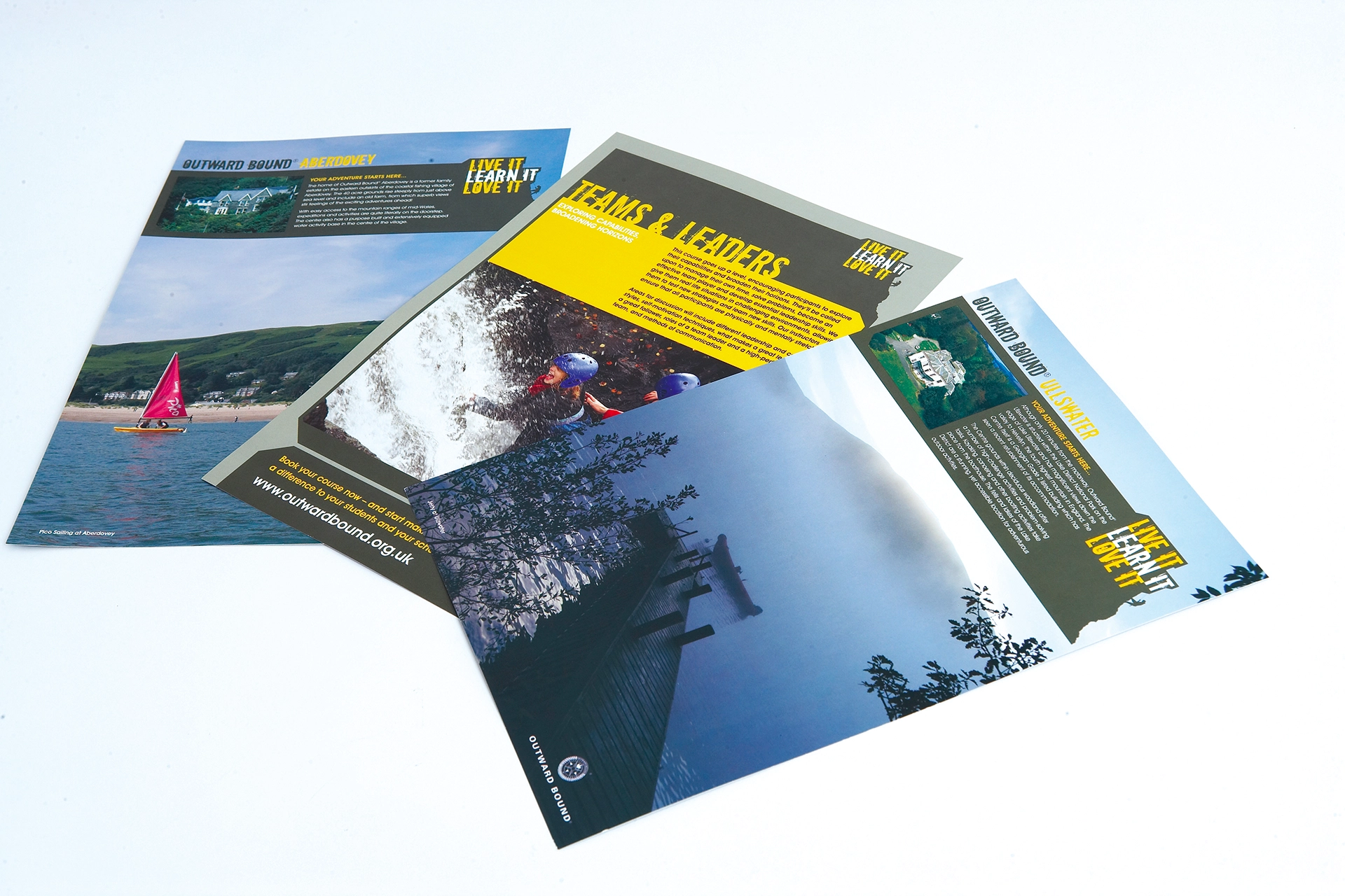
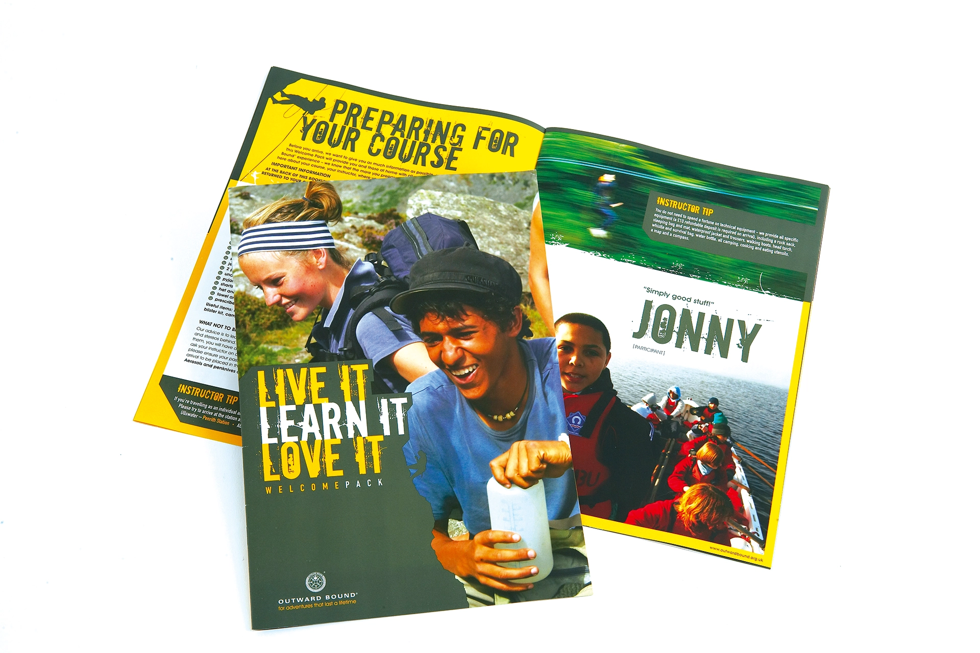
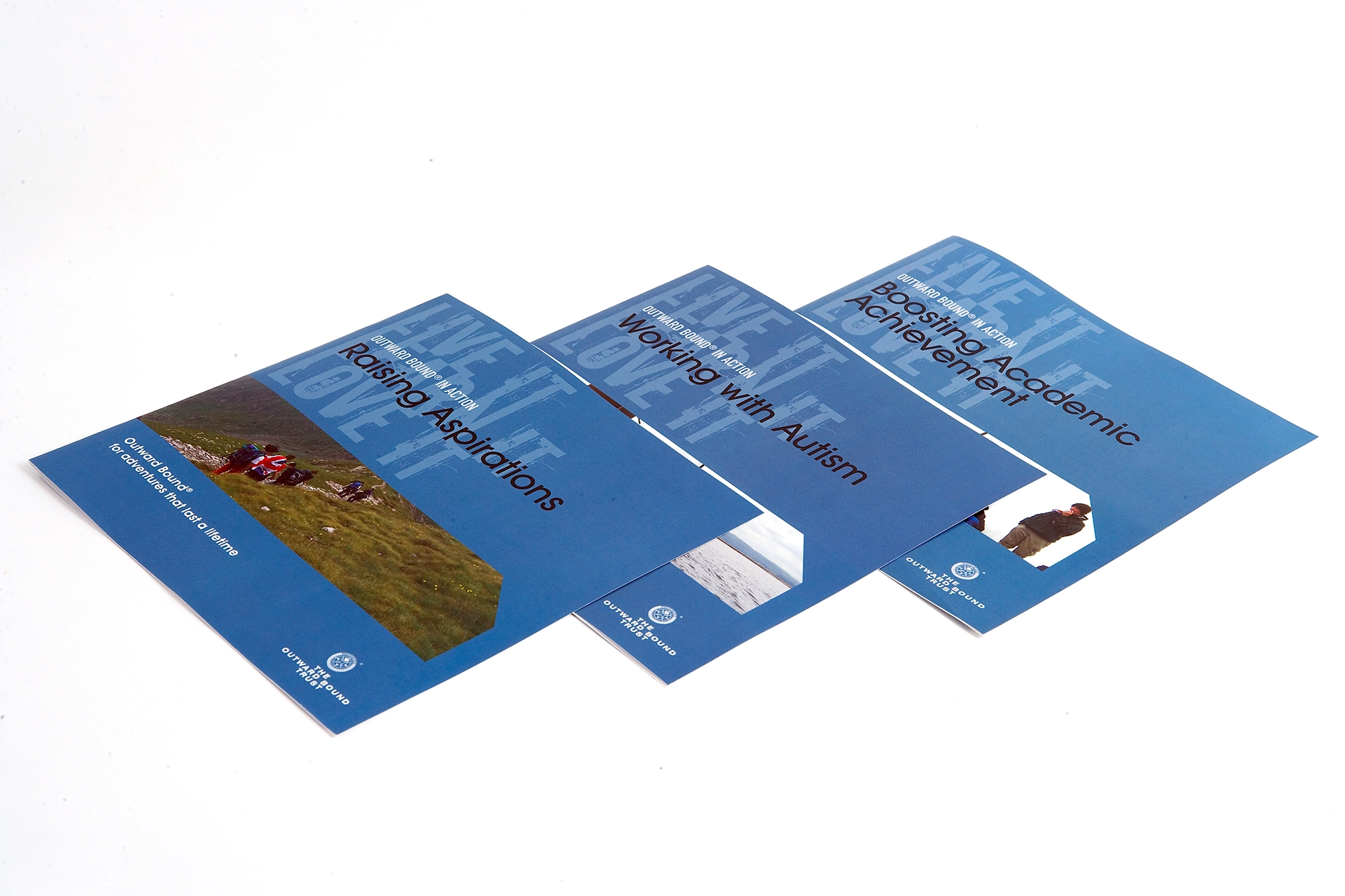
It was identified that the creative solution needed to align to the new website and access was granted to the design. With this in mind, we started by ensuring that any creative solution involved a flexible grid system that matched the website, but would work across different print executions. With this approach finalised, the next item was to come up with an umbrella concept that encapsulated what the Outward Bound Trust did. With their mission statement, “Our mission is to inspire young people to defy their limitations so they become strong, resilient and curious, ready for the challenges of life.” At the forefront on our design thinking, we coined the concept, “learn it, live it, love it.”
The following design elements were created:
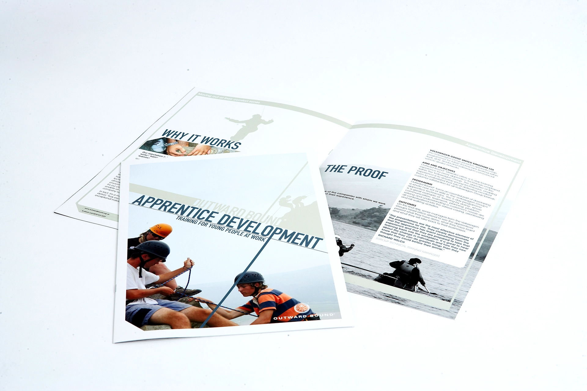
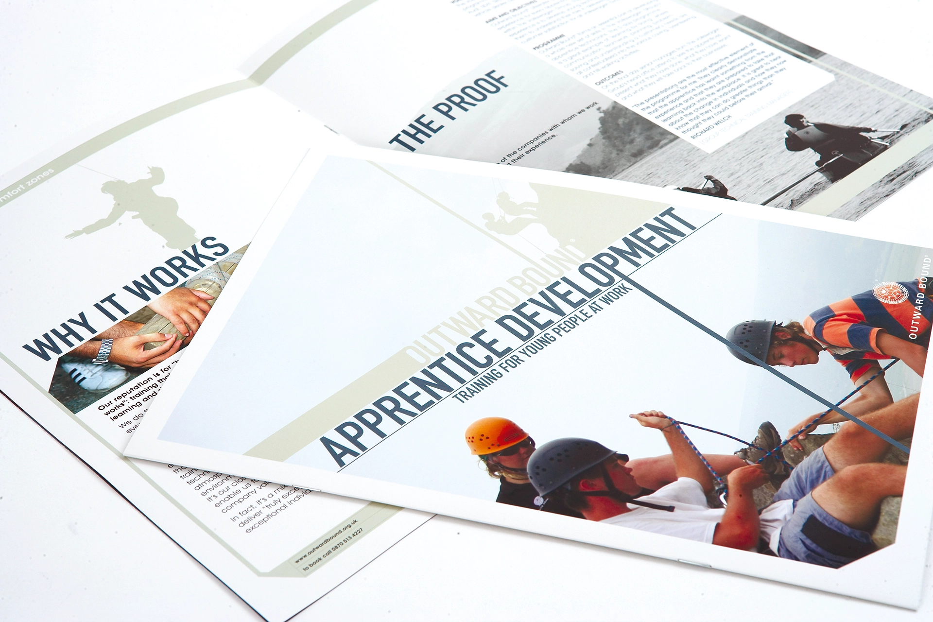
- An angular device used to cut images on corners and shapes. Images were used in pairs, where the main focus was a student or participant, and the minor image was an activity to demonstrate partnership and participation.
- A geometric stencil effect typeface gave a visual nod back to the military history of the Outward Bound Trust, paired with Avant Garde for overall flexibility.
- Gritty distressed secondary typeface visually aligned to the outdoors.
- A colour palette was created to be used across course and audience types to ensure consistency of message.
The main focal point of the project was a course brochure, which was designed to be easy to navigate, so we used a slightly different size and featured an address book style navigation on the right hand edge of each double page, spread that allowed ease of use.
Once the main brochure had been produced, the new brand identity was rolled out across case studies, fundraising brochures, advertisements, reports and school packs over an 18 month period.
All the brochures were printed using 100% recycled paper, FSC accredited to ensure the print aligned with the Trusts environmental commitments. Although the Outward Bound Trust have since moved their brand identity onwards, these still look on point!
Results
The evolved brand identity improved the OBTs overall visual style and consistency of messaging whilst remaining flexible enough to work well for the various demographics, from school children, and teachers to corporate sponsors and businesses.
Elizabeth Eaton, the now former Head of Marketing at the Outward Bound Trust said, “I worked with Paul and his team on a suite of successful brochures and marketing communications for Outward Bound and enjoyed their creativity, speed of execution and good humour. They were especially patient and gracious, allowing me to sit alongside him in the studio while we tweaked and amended final proofs on screen.”