Alfred McAlpine Slate, a Welsh slate quarrying company, approached Think for a rebrand. The challenge was how to create a memorable rebrand without abandoning the Welsh heritage that has been so important.
The typography needed to reflect both the drama of the slates’ natural textures and colours. To ensure Alfred McAlpine Slate’s promise was fulfilled, we paid close attention to typeface style and print finishes with exactness.
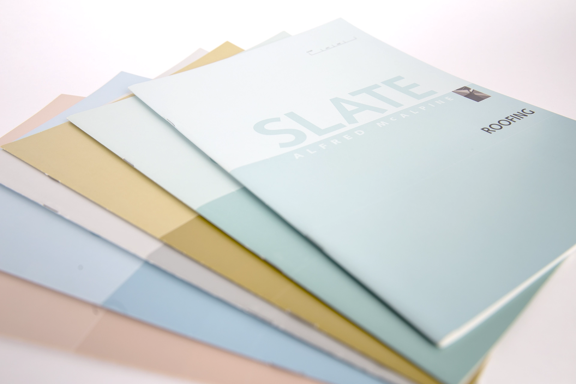
Welsh Slate is known for its incredible quality. Having a brand identity that reinforced this unique product positioning was considered to be essential and a full rebrand was undertaken. To further enhance the rebrand, a suite of marketing brochures was developed which showcased the product’s qualities.
The importance of typography in print
To maintain the classic typography that embodied their unique brand identity, we choose a font featuring both elegance and drama. We applied this unique typography style to all brochures to convey the atmosphere of Welsh slates.
The typography also needed to be tactile and eye-catching to draw attention to the product’s extraordinary qualities. To achieve this, a range of printing techniques and textures were used to enhance the look and feel of the brochures.
The Challenge
The challenge was to create something unique yet timeless that reflected Alfred McAlpine Slate’s personality and heritage. After extensive research, the typography and design elements were carefully selected with meticulous attention paid to texture, colour and drama.
The brand design for slate draws inspiration from its many architectural and interior design applications, including cladding, roofing, flooring and worktops. The unique qualities of this versatile product are celebrated throughout the branding process.
A positioning statement was created:
Drama: Texture: Colour : By Design
This statement provided a foundation for the logo design. The Syntax font family was selected to capture the timeless beauty and unique texture of natural slate. Its chiselled appearance evokes an aesthetic that is both raw and sophisticated.
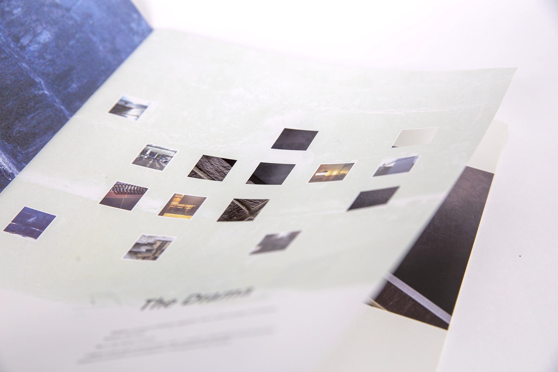
On the third page of their corporate brochure, two breathtaking pictures of slate tile and quarrying were featured. A die-cut was used to make the pictures more captivating. This set the perfect ambience for introducing their services.
The closeup image of the slate tile truly brought it to life! A beautifully clean design allowed the photography of the various products to shine through.
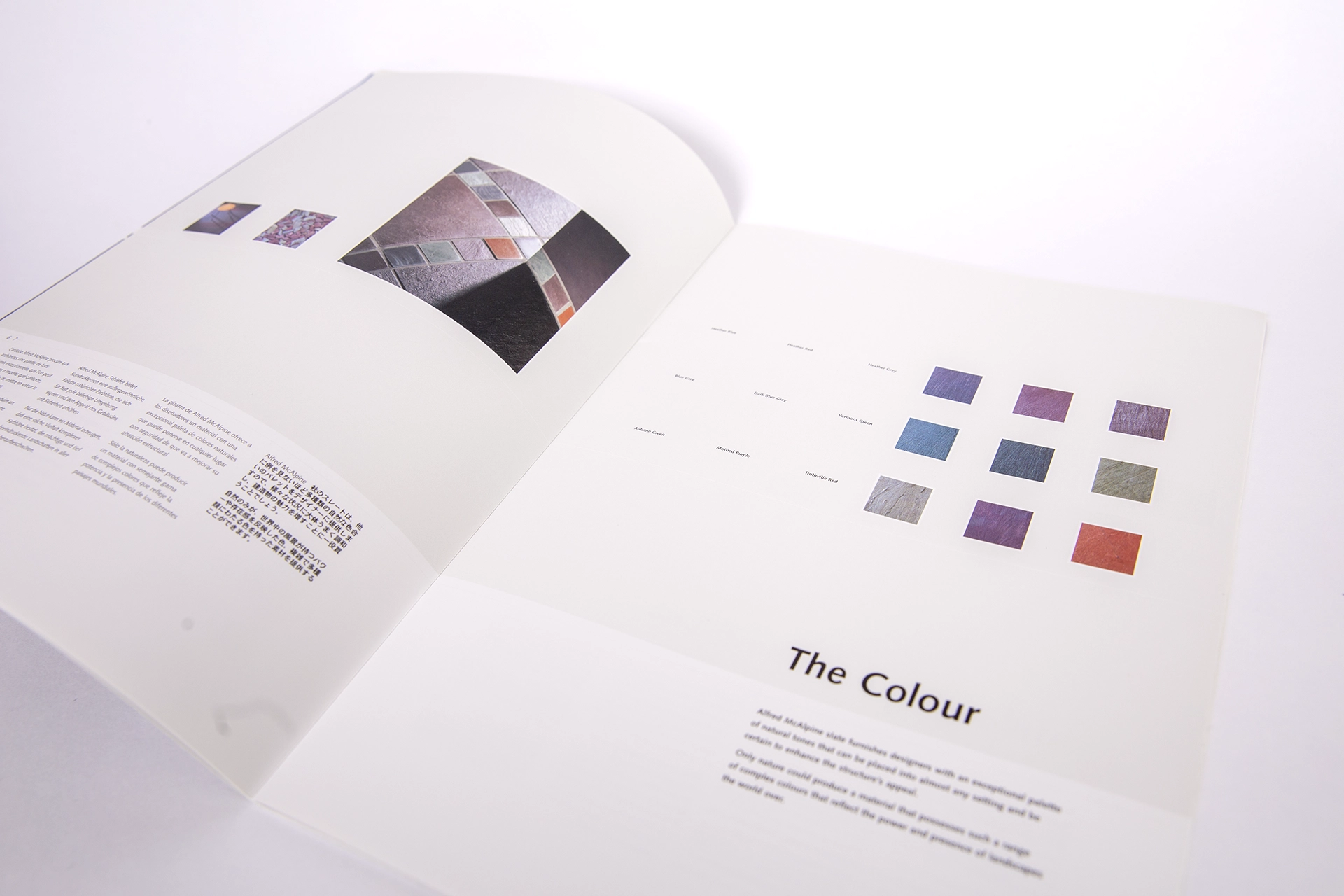
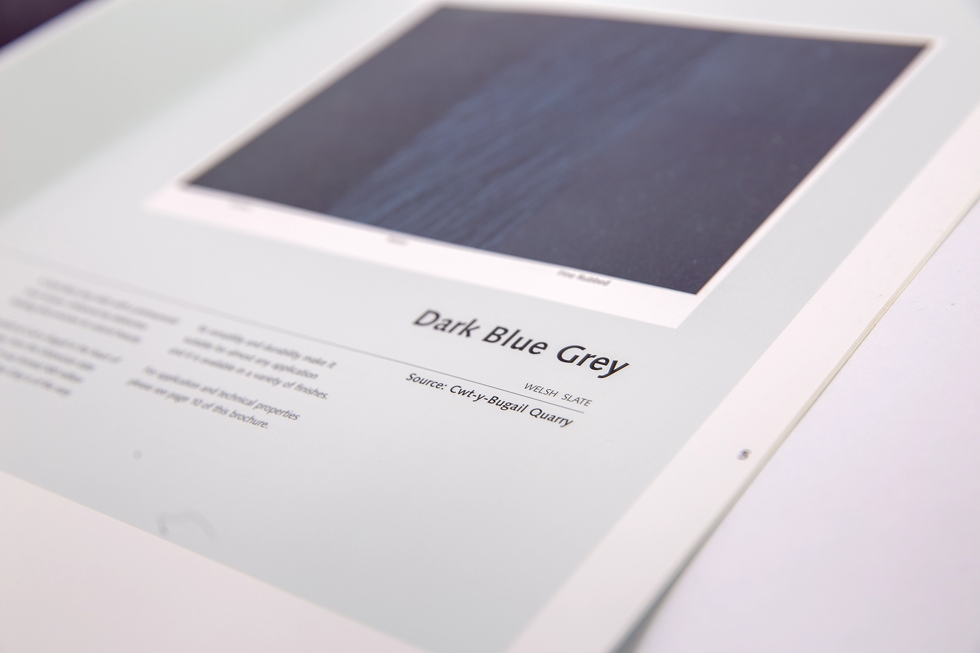
Our product brochure is the perfect resource to make sure you select the right item for your needs. With 3 different finishes and 9 colours to pick from, there’s a variety of options to choose from! Close-up shots were included in their respective shades as well as colour swatches!
To create distinct sector identities, a suite of colourful brochures was crafted. Each individual industry was assigned its own unique Pantone hue. To ensure the highest quality, these prints were created using 4 colours and a Pantone via lithographic printing. These items were then housed in a box file that was custom designed and printed. The brochures were also printed using Stochastic Screening to eliminate any traces of conventional print screening on the roofing images. This advanced process helps us ensure that our customers have access to exceptional-quality visuals without any distortions or imperfections.
The Results
The results have been a huge success. The use of typography and creative design featured in the rebrand perfectly captured Wales’ stunning slate landscape. An eye-catching, memorable design helped Alfred McAlpine Slate stand out from the competition. This rebrand has enabled Alfred McAlpine Slate to proudly showcase its heritage and outstanding product quality.
We are immensely proud of this design project that brought the Alfred McAlpine Slate rebrand to life. Think are dedicated to helping them maintain their Welsh heritage while maintaining a modern appearance that customers can be proud of. Working closely with them, we ensure all aspects of the brand remain true and consistent.
If you would like to find out more about our typography print and design services, please do not hesitate to contact us. We are always happy to help!