An exercise in brand evolution for Rowe Hankins
Getting the brand back on track for an international rail engineering company.
Getting the brand back on track for an international rail engineering company.
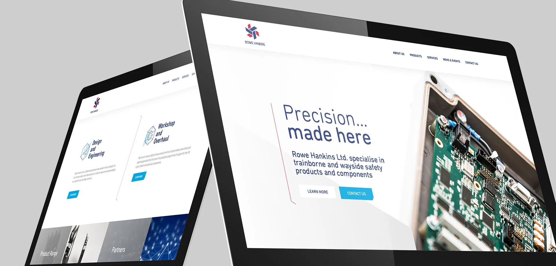
For over 30 years, Rowe Hankins have been designing and manufacturing safety equipment for the rail industry. With a global reputation for quality, reliability and innovation, it was time for the brand to reflect this.
Our challenge was first to demonstrate the value in creating a consistent and strong brand presence that reflected the business values and reinforced the strap-line: “KEEPING RAIL JOURNEYS MOVING SINCE 1985.”
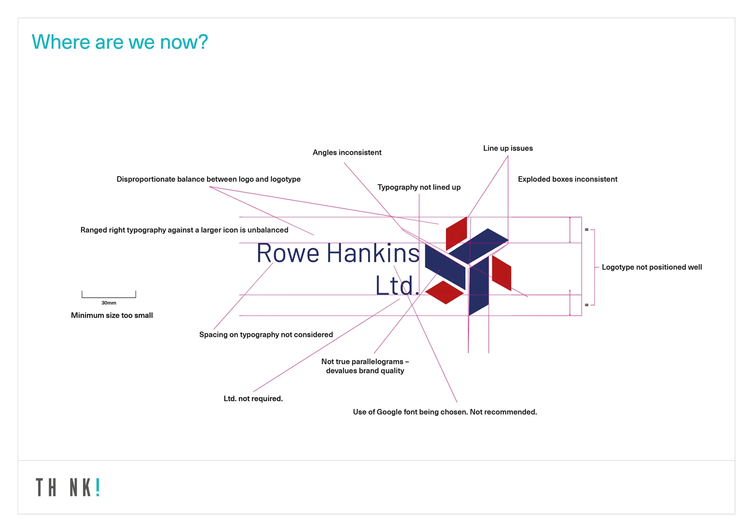
Unfortunately, the existing brand toolbox was incoherent, inconsistent and used elements from various iterations over the years which undermined these statements.
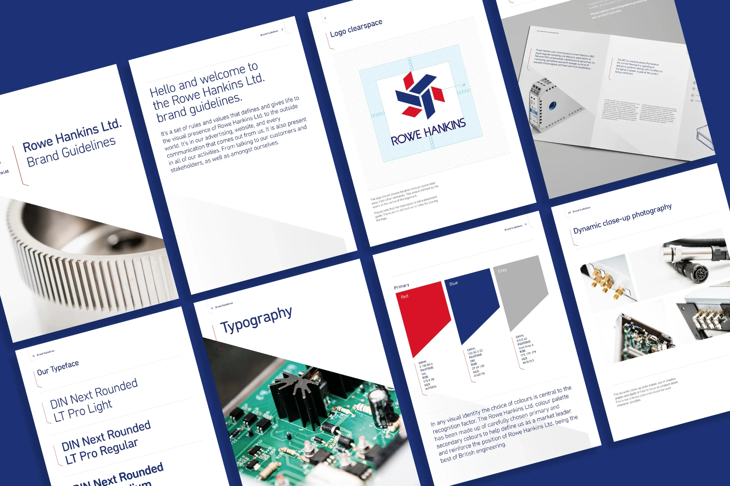
We started with getting the fundamentals correct. This began with a logo health check, analysing the existing Rowe Hankins logotype. Refinements were suggested where required, without moving too far from existing logotype.
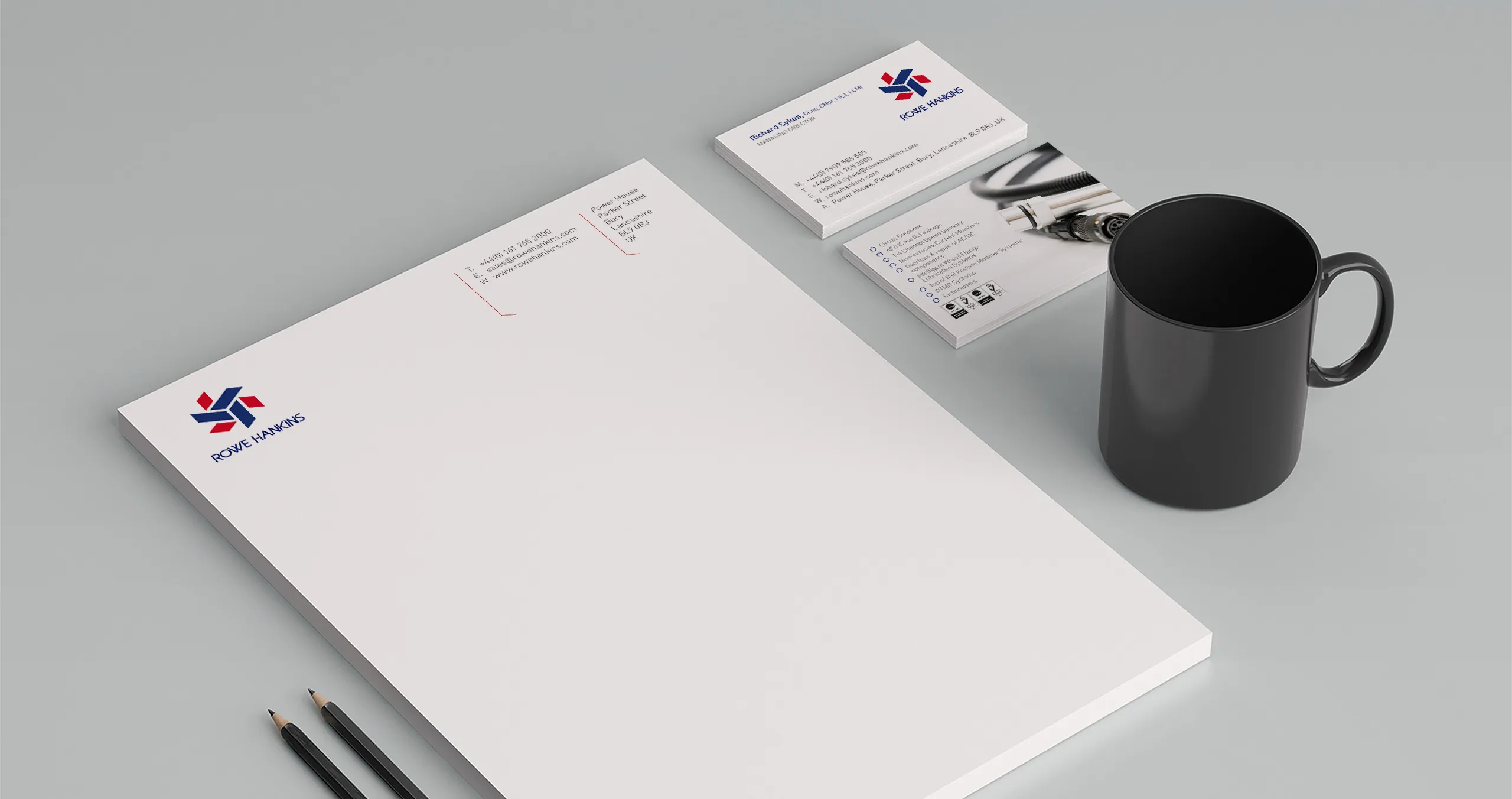
We also had to explain when to add ‘Limited’ or ‘LTD’ to a logo.
It was our belief that Rowe Hankins:
Adding Ltd. could confuse the audience. Recreating the foundation of the logo device highlighted imperfections in the icon. To ensure accuracy, the aim was to showcase and mirror the business’s commitment to precision engineering. Minor adjustments were made to create a perfect circle.
Next, we proposed changing the red and blue colours currently in use to those found in the Union Jack flag, specifically Pantone 280 and Pantone 186. This small change reinforced the positioning of Rowe Hankins being the best of British engineering.
We also created a beautifully engineering bespoke typeface for the logotype.
increase in users
increase in top 3 keywords
increase in top 10 keywords