Brady PLC
A global rebrand for Brady that’s ahead of the curve
A global rebrand for Brady that’s ahead of the curve
Brady came to Think to get ‘disruption ready’. As an industry leader in commodity logistics, Brady recognised the necessity of shifting their approach. They needed to transition from a product-focused software provider to a customer-centric, consultative one. Their goal was to deliver strategic and innovative commodity software solutions to their clients.
Brady completed significant market research and competitor analysis and the central proposition derived was ‘Keeping our customers ahead of the curve through innovative software solutions and the quality of our people.’
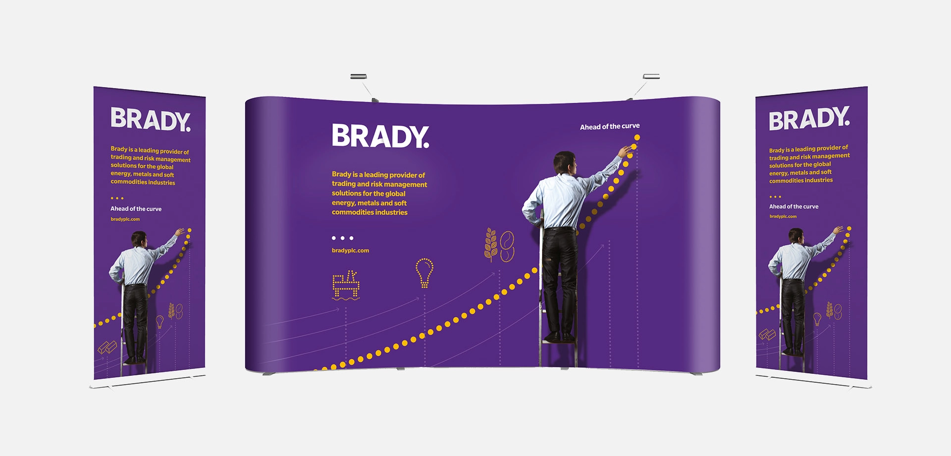
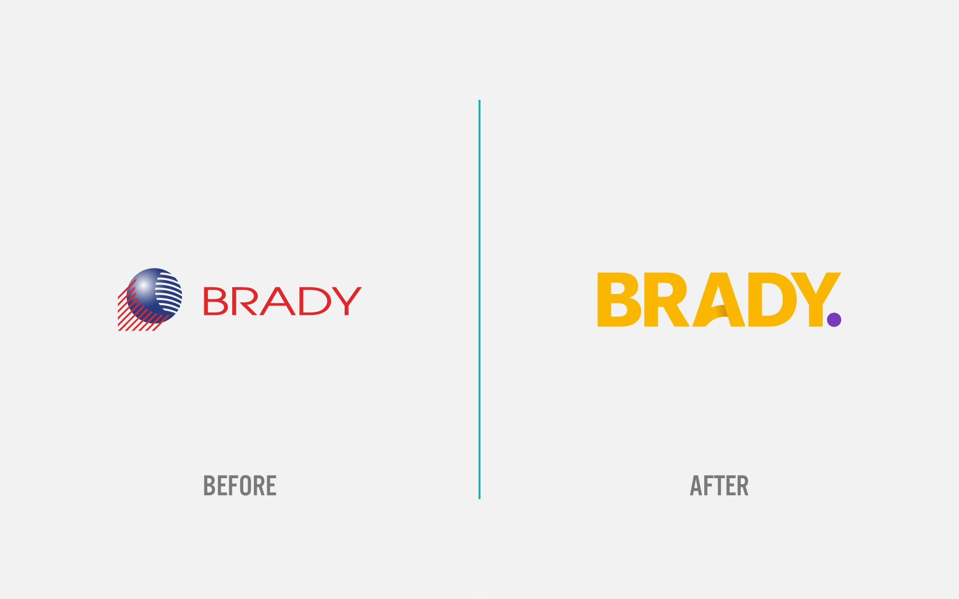
We approached the brand identity with a focus on the ‘ahead of the curve’ concept. The final design used the crossbar of the A to create a ‘curve’ within the logo. We took care to create a perfectly circular crossbar in the design. This negative space became a ‘dot’ that served as the basis for the visual style and logo signifier.
We crafted the logotype from a custom Slate typeface. Due to its modern sans-serif font from 2006, we chose this particular logo, designed for excellent legibility.
This typeface family became the primary choice for the brand identity due to its flexibility, including language support in the Pro family.
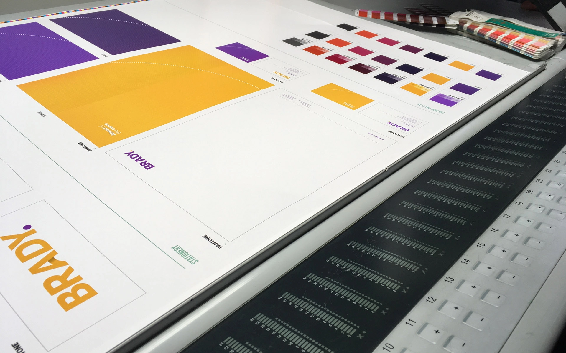
The biggest problem we faced was colours. Their purely digital product required primary and secondary colour palettes suitable for both print and screen applications. After exploring a number of different options, we produced an 11 colour A1 wet proof of the main colours showing both CMYK and Pantone options and we were able to press pass this. It was definitely worth it, Brady had specified an orange that appeared yellow on some of their own screens. When the wet proof was sent to London for approval, the team were shocked by its excessive orange hue. We resolved this issue by selecting additional yellow-toned colours and sending Pantone swatches. It was important to get the Pantone correct because the logo design features a black over print on the A’s crossbar.
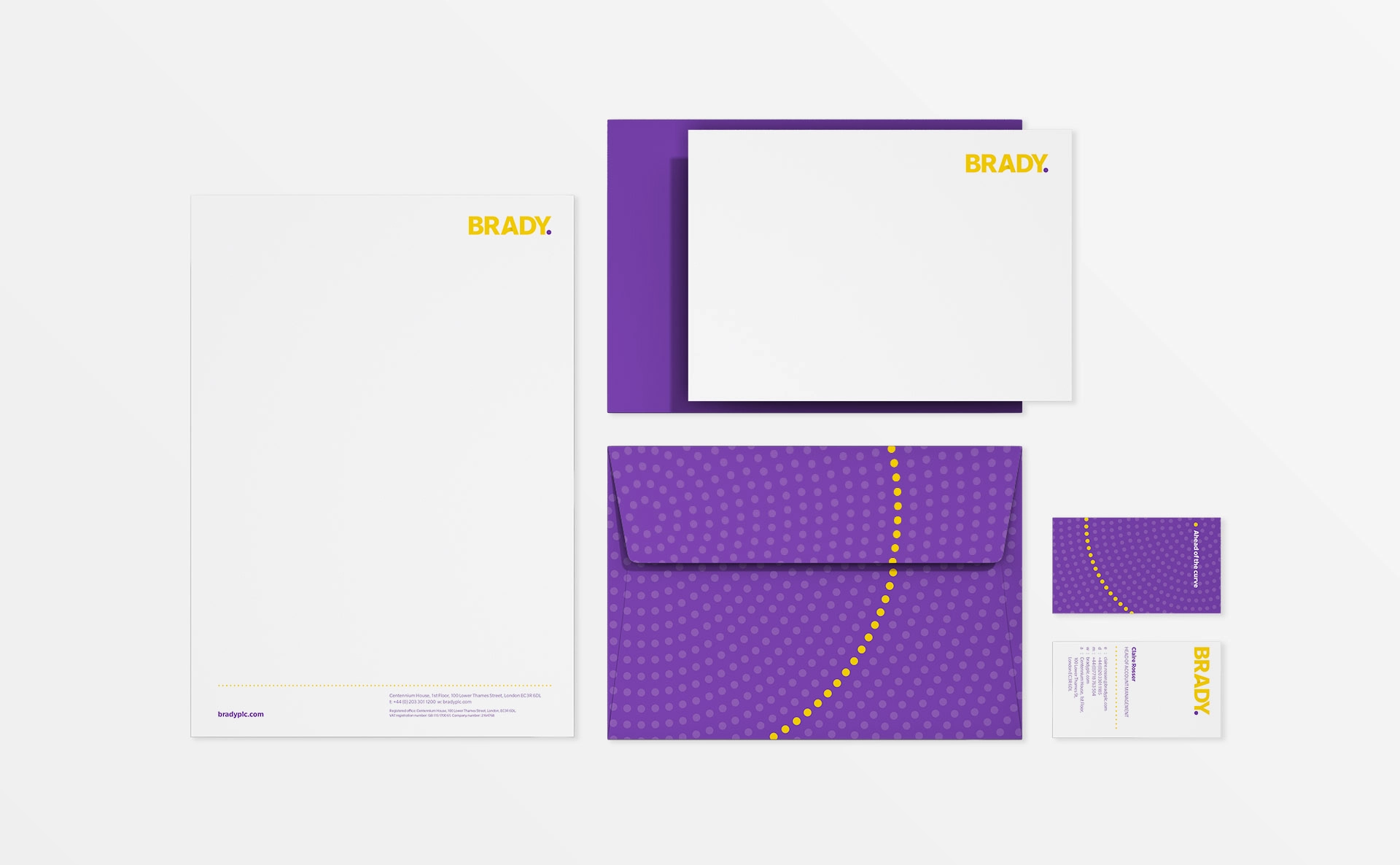
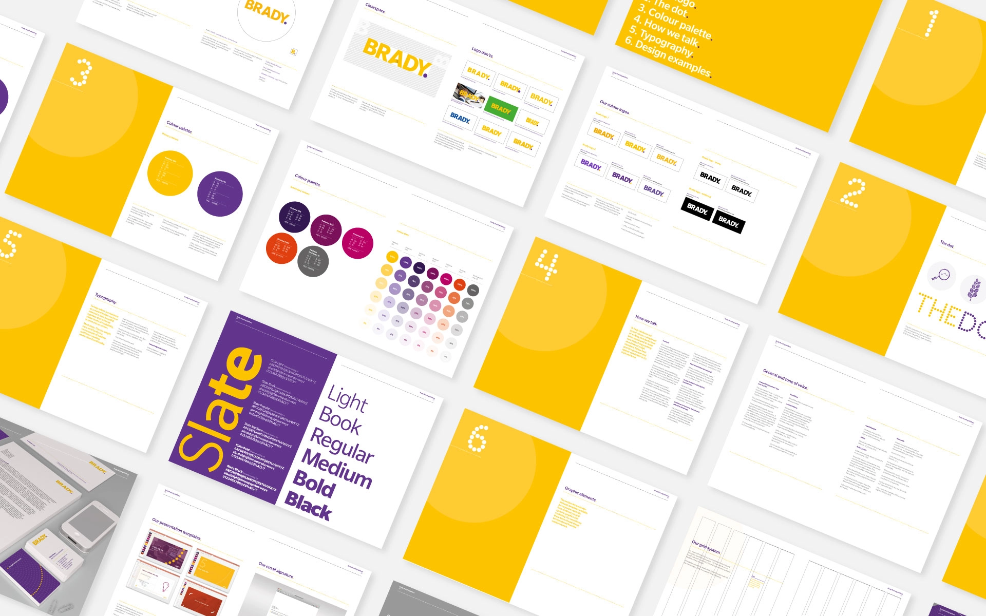
The final project included: