Wood Street Mission
A complete brand and campaign overhaul for one of Manchester’s oldest charities
A complete brand and campaign overhaul for one of Manchester’s oldest charities
Wood Street Mission is one of Manchester’s oldest charities founded over 150 years ago.
They help thousands of children and families living on a low income in Manchester and Salford by providing practical help to help meet children’s day-to-day needs and improve their life chances through a number of campaigns.
As an independent charity, they rely entirely on supporters to raise and donate funds and items, and to raise awareness of their work in the Manchester charity campaign sector.
In a very crowded sector, it was difficult for Wood Street Mission to be seen amongst the trees.
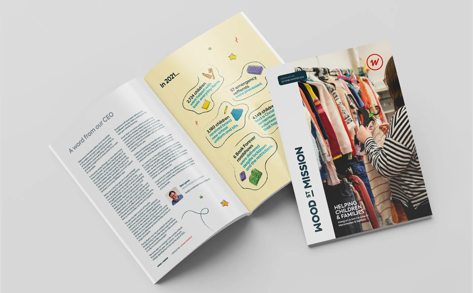
Our print partner Galloways referred Wood Street Mission. At first, they partnered with us to create their annual newsletter. Throughout this collaboration, Des, the CEO, outlined his vision to standardise the charity’s visual identity. This included making everything more consistent.
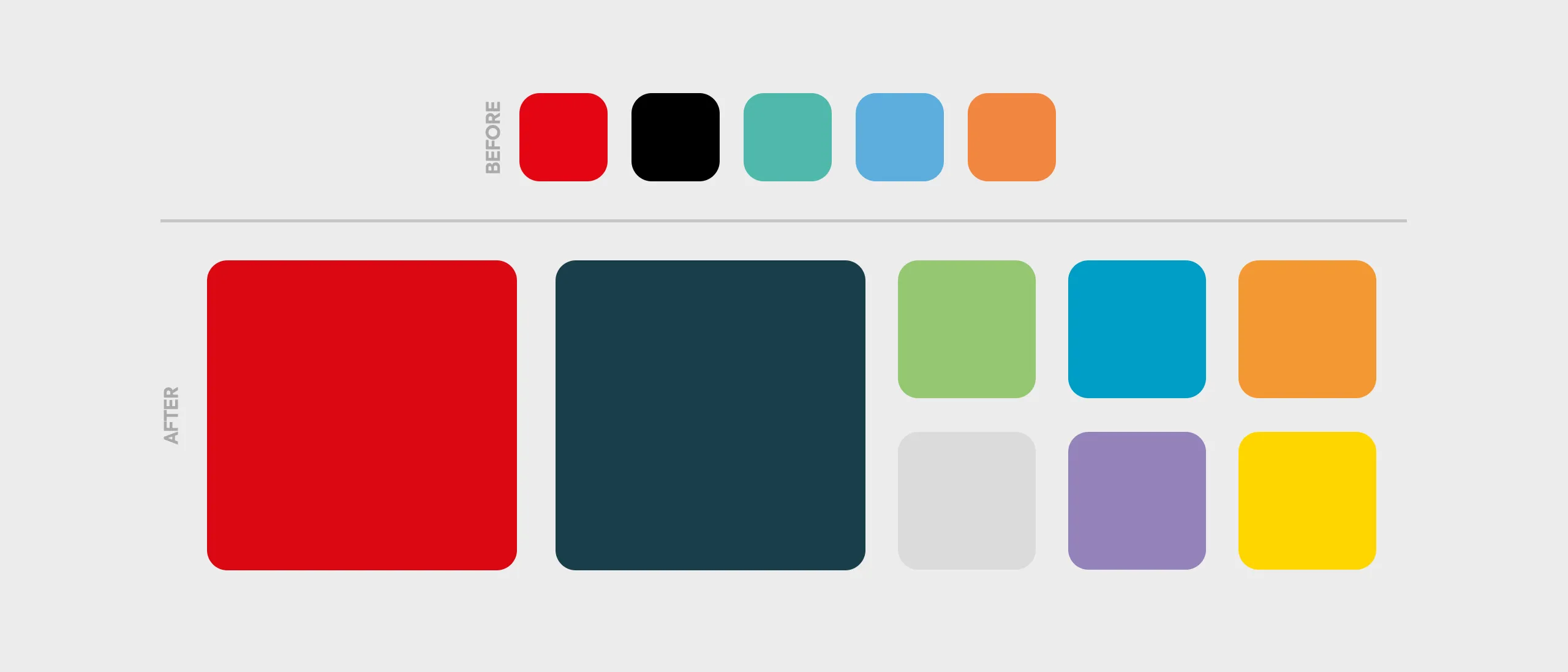
After years of working with freelancers, the brand ‘style’ had become muddled. It was all in need of a brand refresh.
After delivering the newsletter successfully, we returned to Wood Street Mission. We discussed their brand and how Think could assist them further. This included agreeing a list of deliverables that would be included as well as a detailed brand guidelines document. You can download this here.

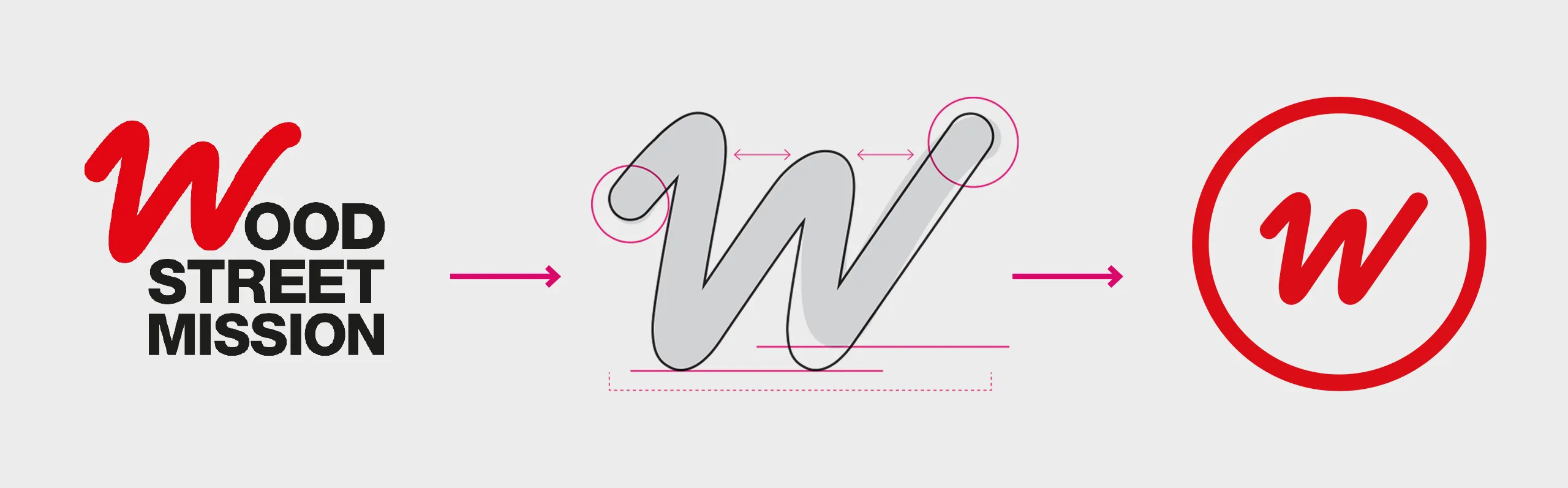
We started with a brand audit. This is where we analysed the current brand against the environment it competes within for support and donations. From the audit, we explored how we could potentially develop a visual style for a campaign and how the proposed evolved logo would work with this new visual style.
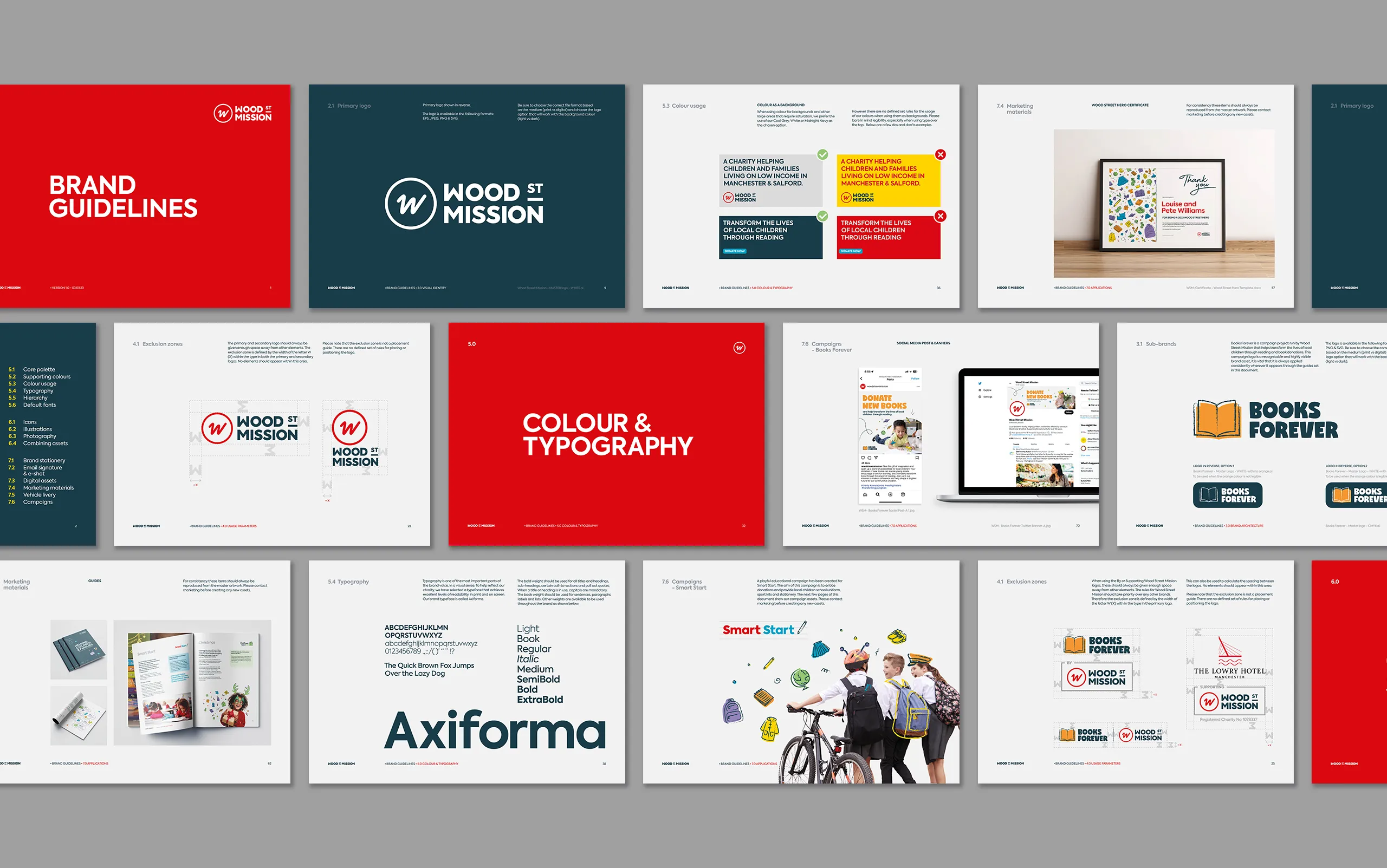
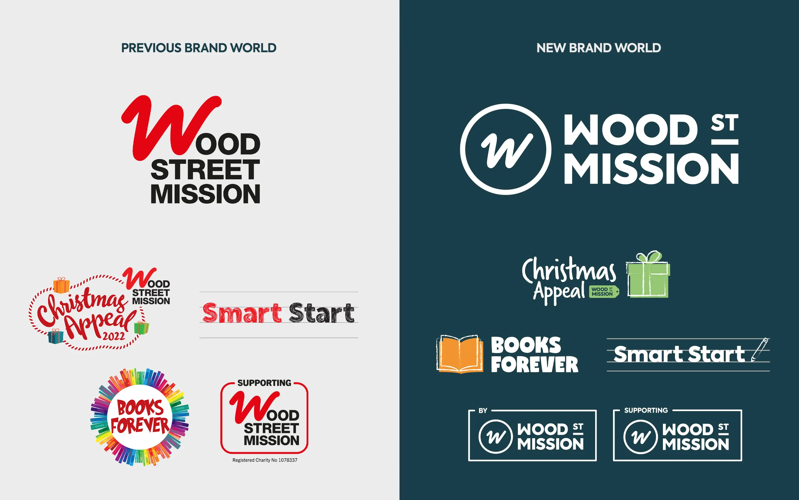
The steps that followed the approved logo involved creating a set of brand guidelines and rules. These guidelines played a pivotal role in ensuring the visual effectiveness of various logo variations. Their clarity and flexibility were also crucial, enabling easy adaptation to diverse design requirements throughout the campaign year.

The guidelines ultimately ended up having two main sections:
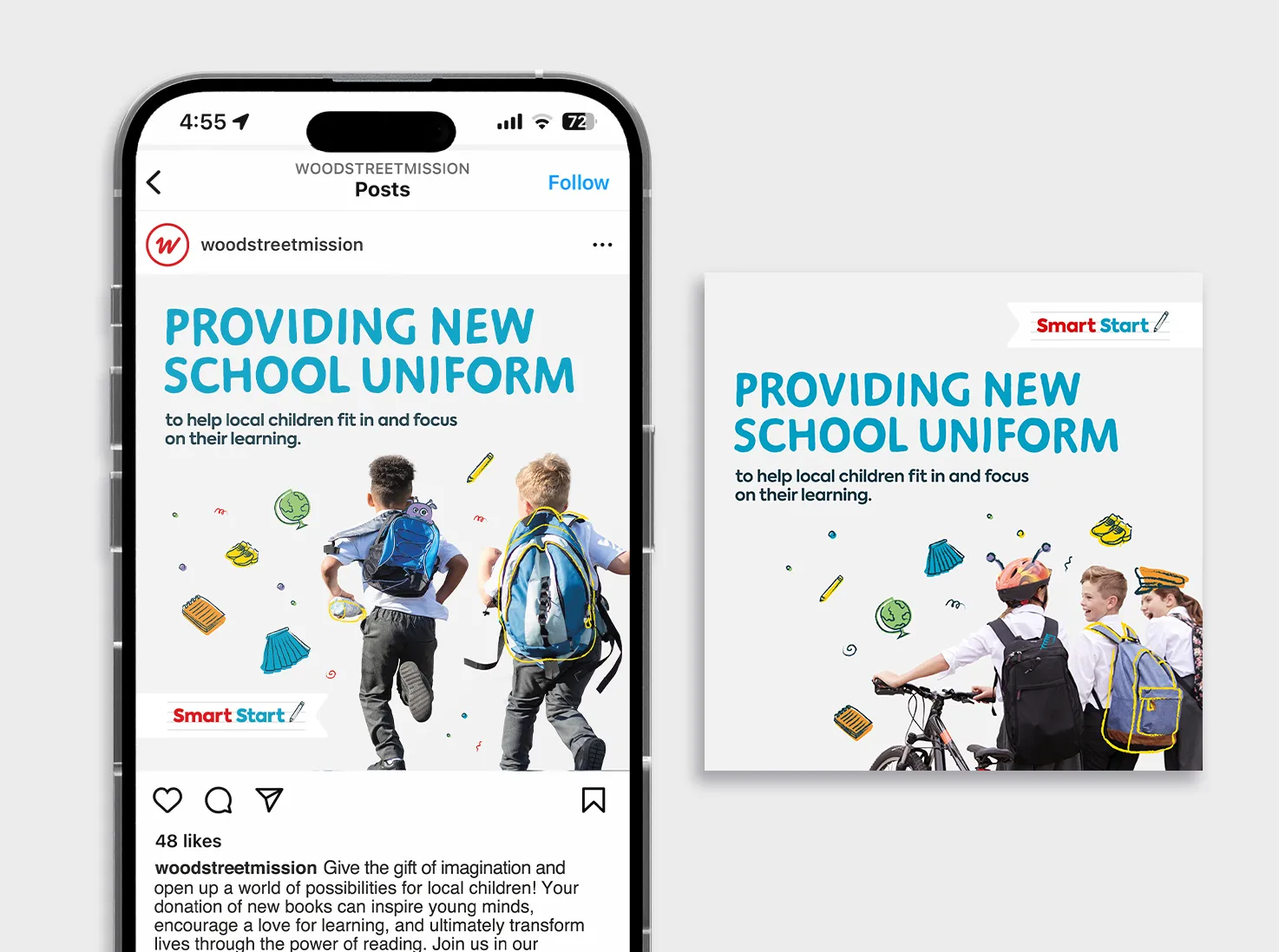
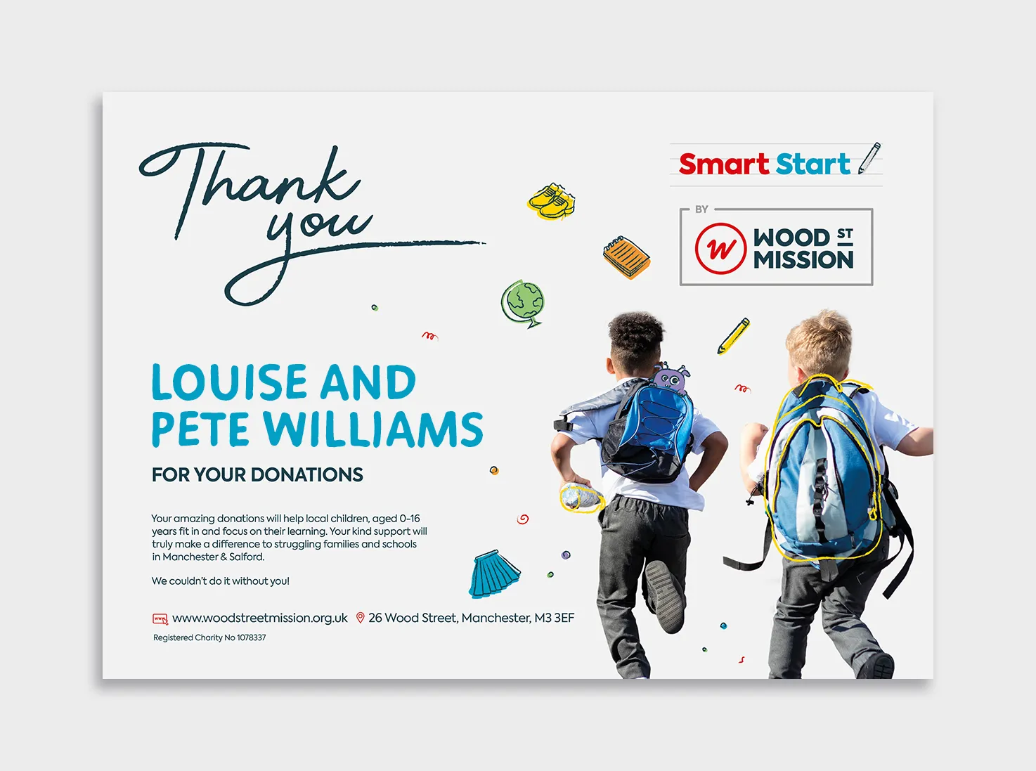
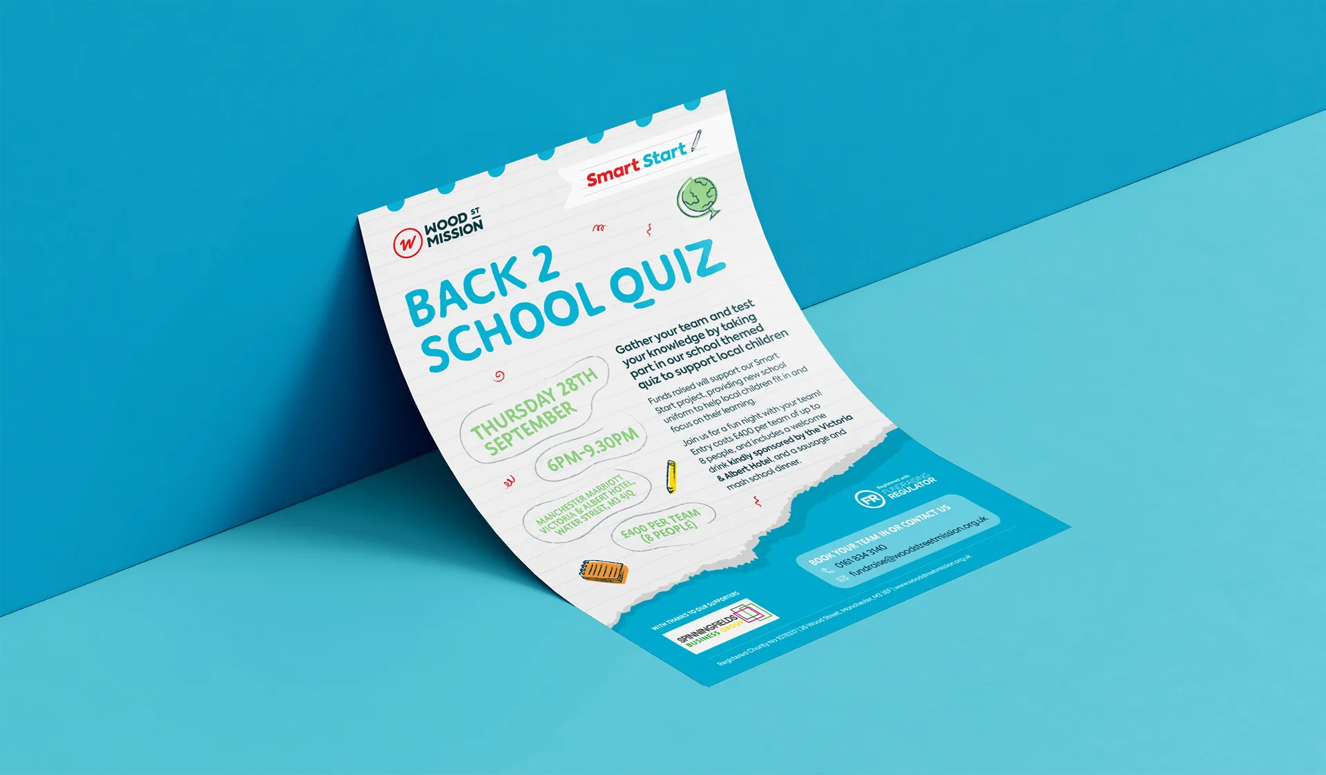
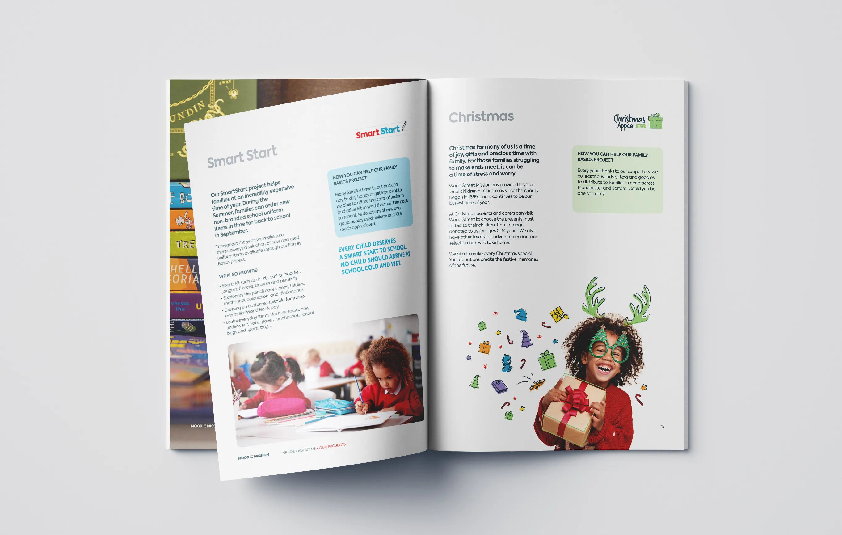
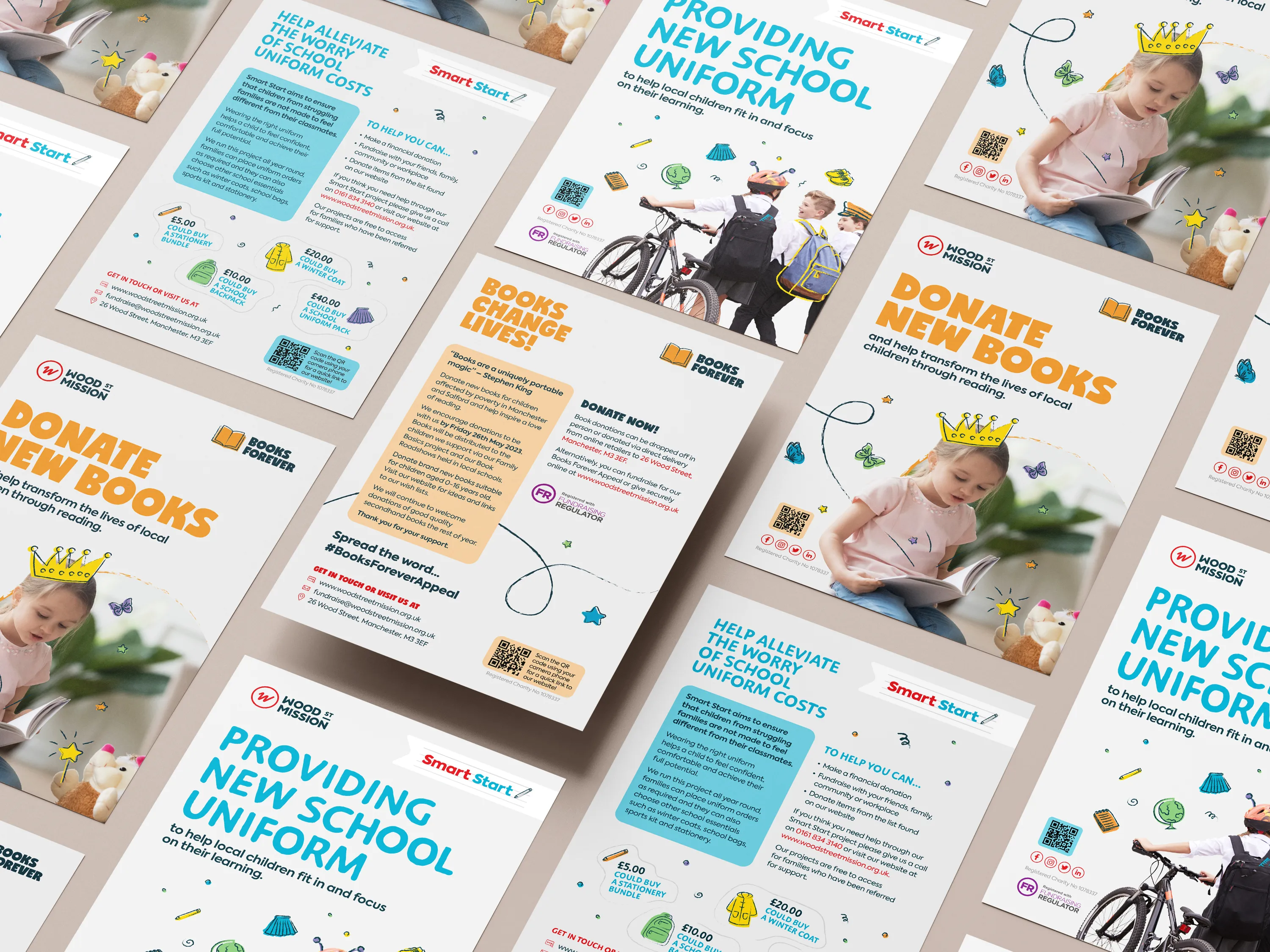
A key aspect of the rebrand was to create a set of campaign sub-brands that were distinctly different, that visually linked to what they were, without them looking inconsistent.
The theory being that they would become more easily recognised as Wood Street Mission campaigns.
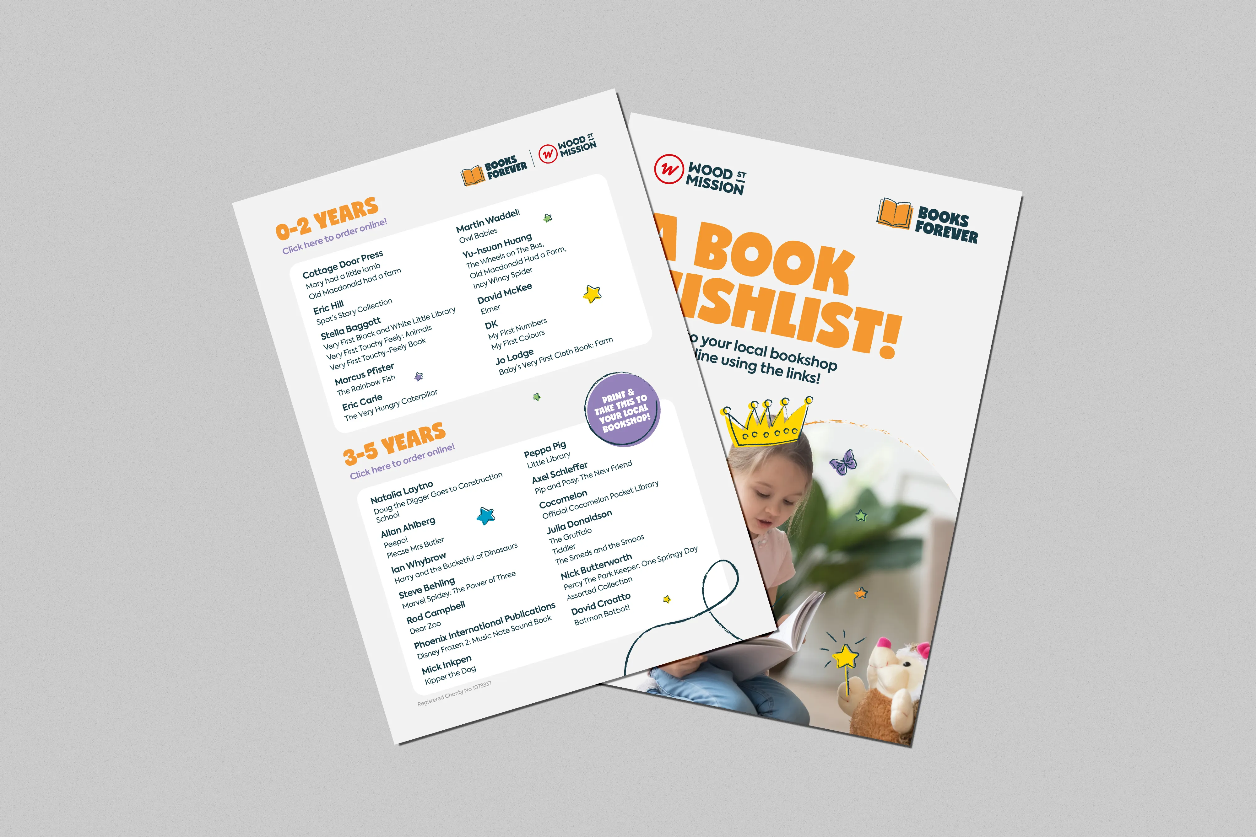
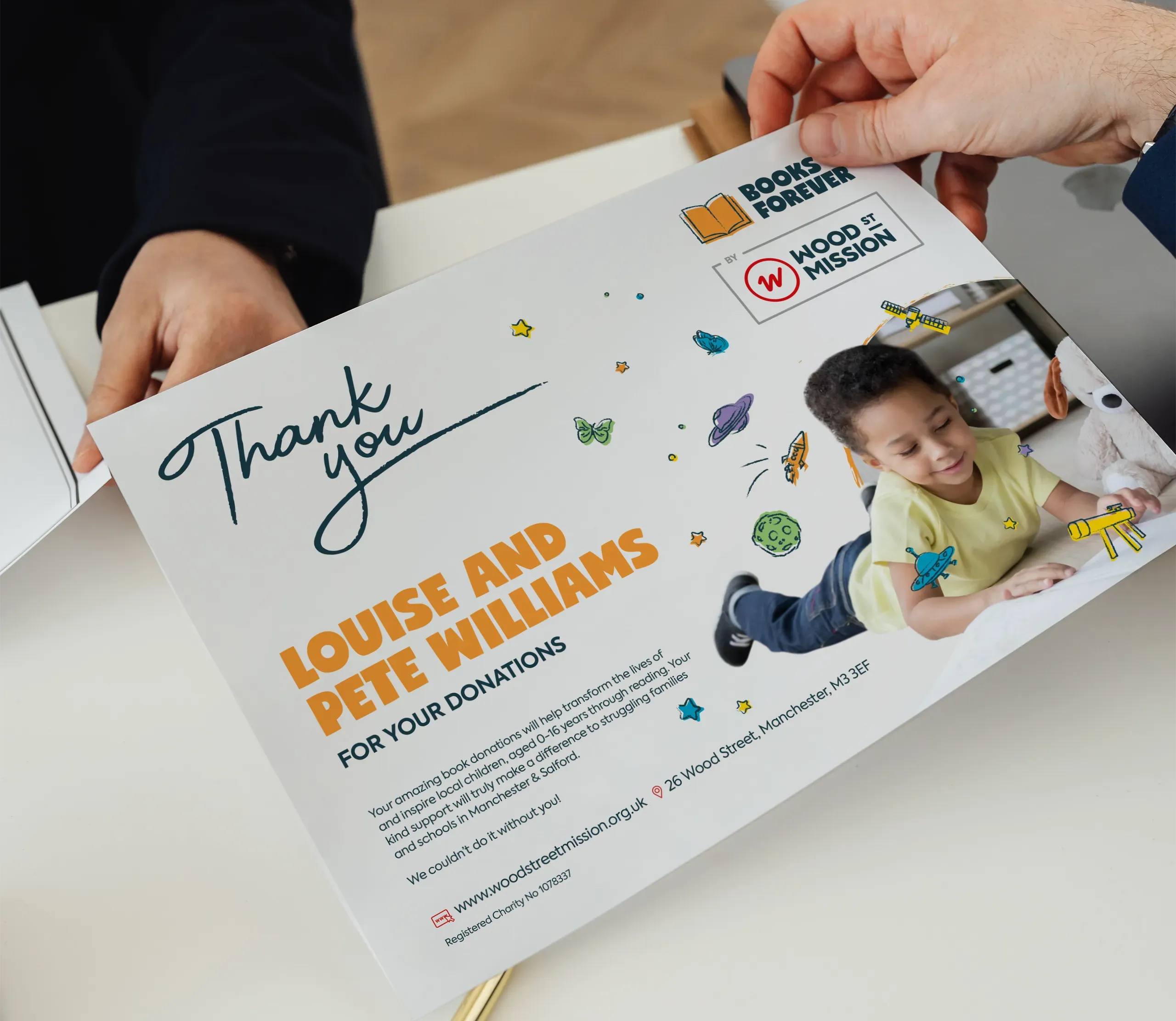
Due to the nature of Wood Street Missions’ campaigns, we have continued to collaborate closely with them. This allowed us to launch the rebrand and seamlessly incorporate new visuals as new fundraising ventures commenced. The first being the Books Forever, a Manchester charity campaign.
With a predefined list of deliverables, we initially set the style for an A5 flyer, creating an illustration and graphic style. This is a normal process as it sets out the visual style.
Subsequently, this extended to the Books Forever campaign collateral. It also served as a reference point for the rest of the campaigns.


Wood Street’s rebranding delivered measurable impact:
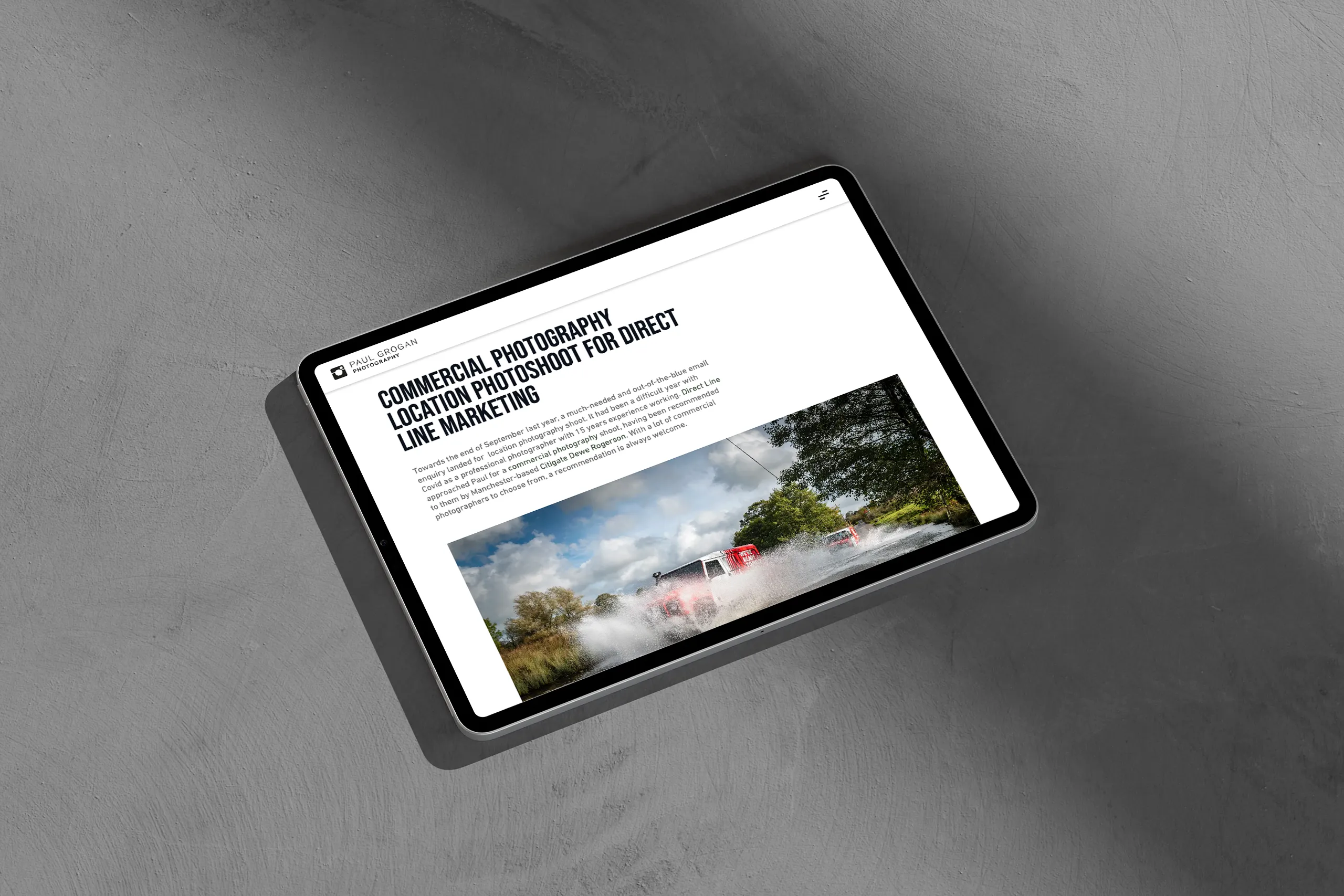
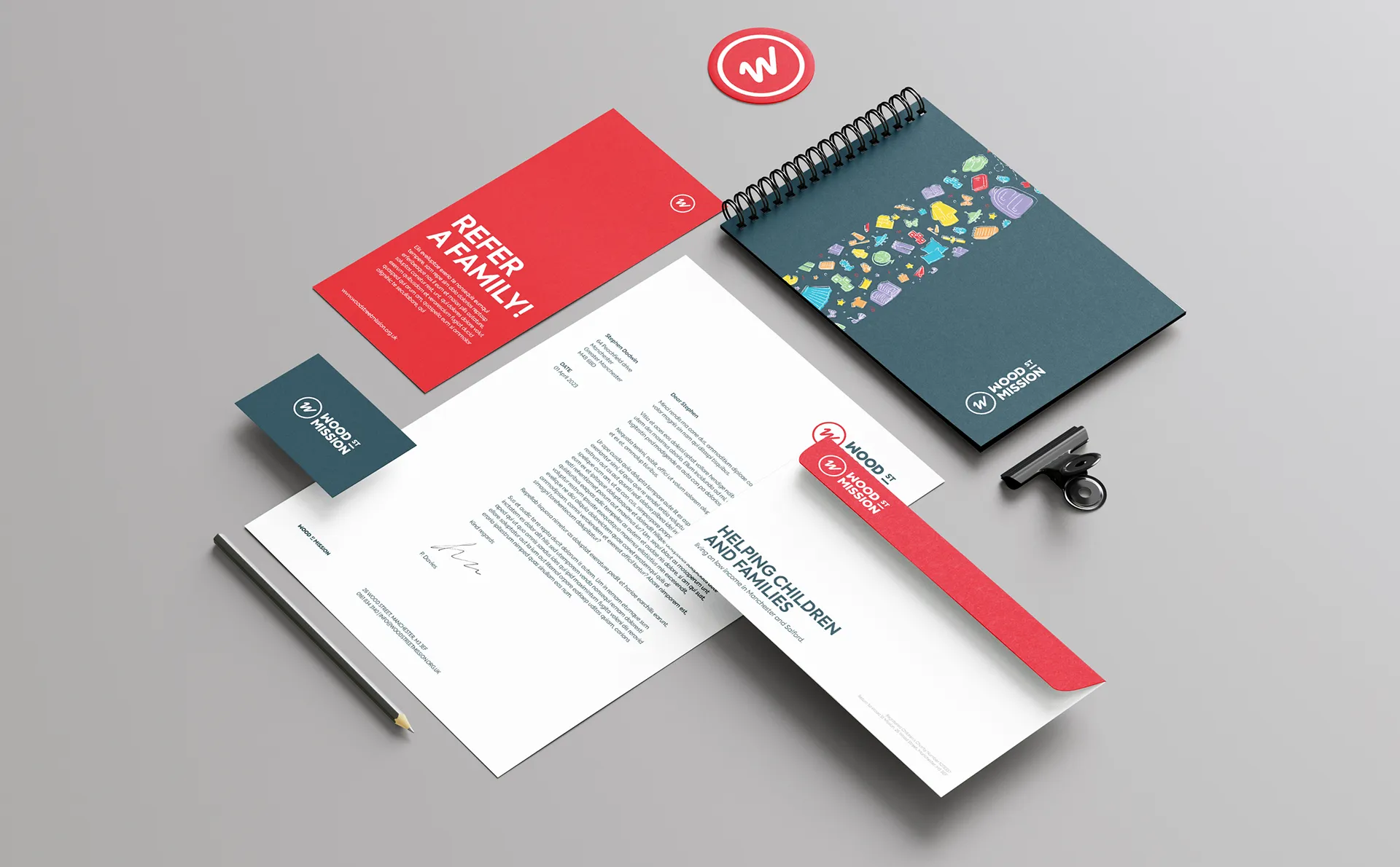
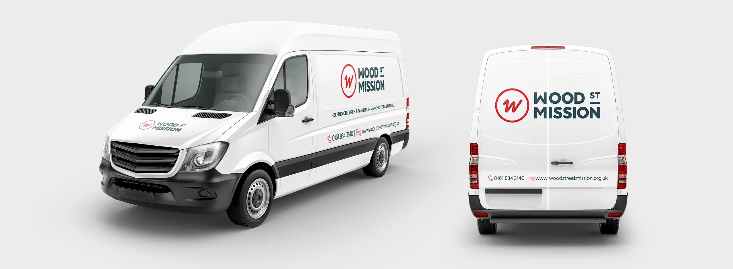
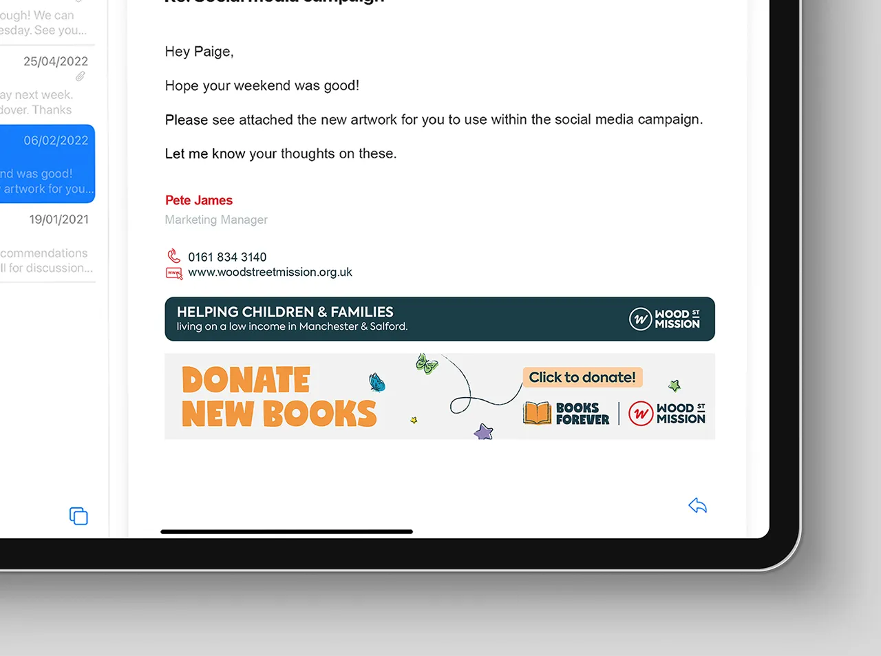
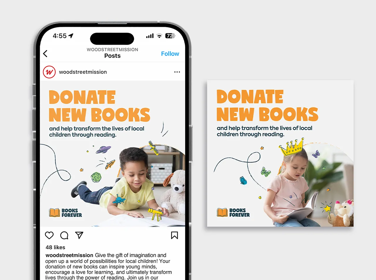
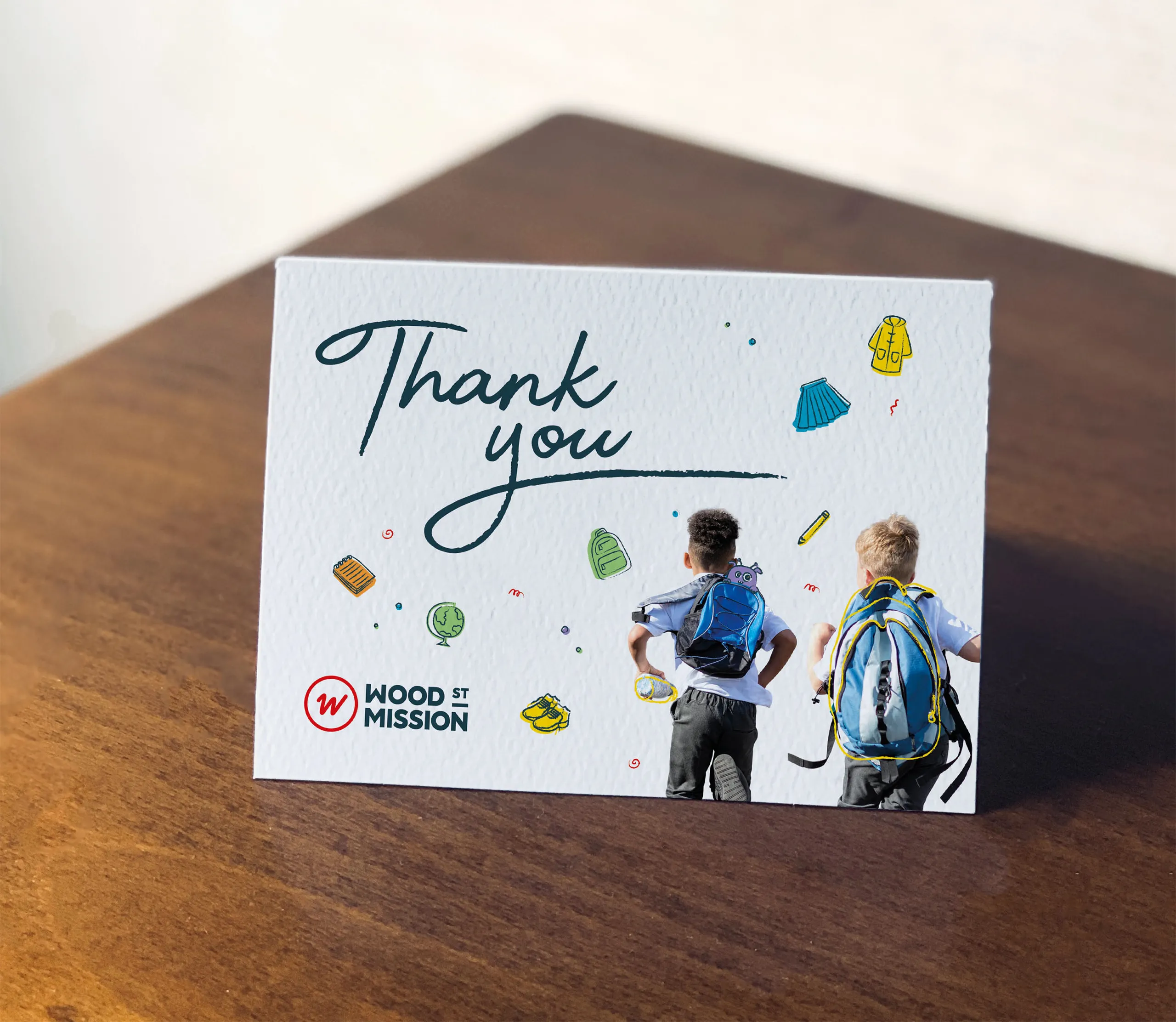
The quality of our execution is evident in the seamless integration of our brands across the various channels. From social to the website, campaign marketing collateral and vehicle livery.
This has helped to consistently deliver engaging content in line with the new branding and effectively communicates their mission and impact.